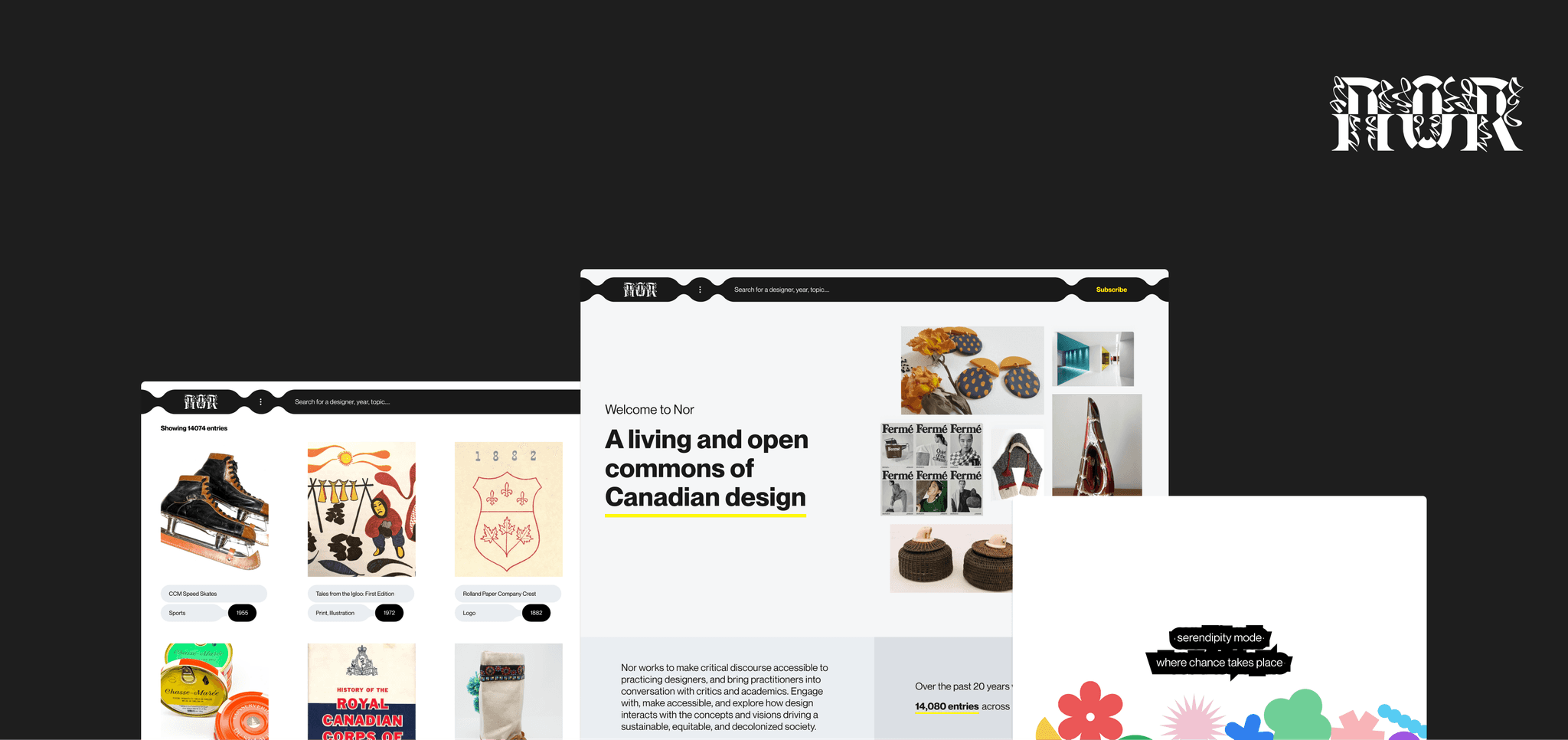
Overview
Problem
How might we improve the experience of Nor by challenging what a design archive could be?
Outcome
We transformed the archive experience by
introducing dynamic discovery tools such as Serendipity Mode
presenting the collection through different storytelling mechanisms like Map and Timeline
inspiring and enriching users through new interactions on the Homepage
Background
What is Nor?
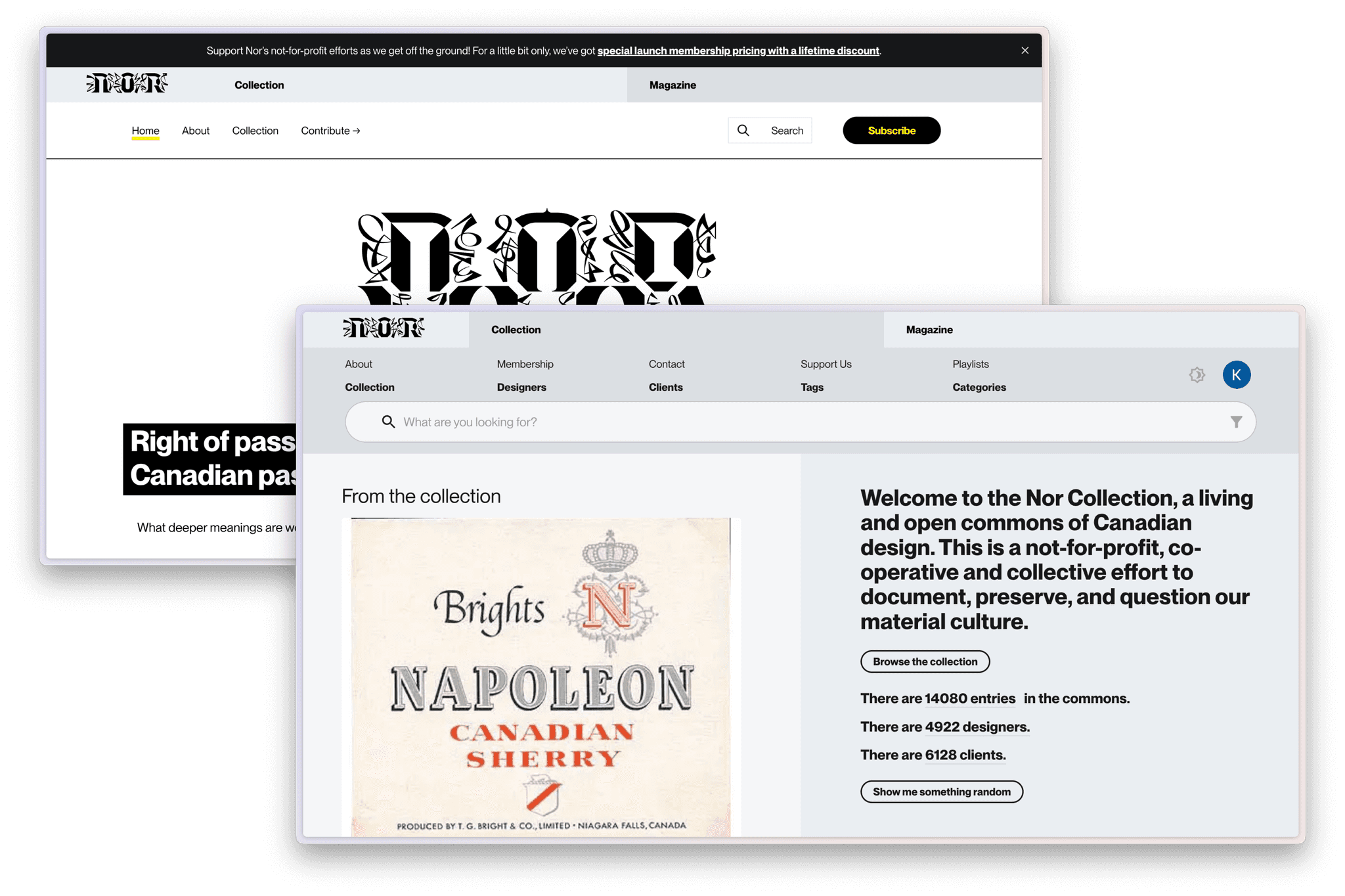
Nor is a living and open commons for design in Canada. It is a not-for-profit, co-operative and collective effort to document, preserve, and question Canadian material culture.
Nor evolved from a 20 year old crowdsourced cultural history platform and design resource, and now aims to be a living design museum.
Nor’s users include design practitioners, academics, students, librarians, archivists, design theorists, and more.
Project Goals
Breaking down the client needs
When we first met with Patrick and Joel (our main points of contact at Nor), they came to us with a very broad goal: improve the experience of Nor by challenging the idea of what a design archive should be. They understood the scope of our project was likely to be determined by our research insights due to the vagueness of the problem statement.
Through a deeper conversation, we broke down the goal into three components:
01
Modernize the experience of engaging with a digital archive through interaction design
02
Optimize content organization in Nor for easier navigation and accessibility.
03
Enhance Nor’s utility as a practical research tool for diverse users.
Research Focus
What is the ecosystem like?
Our initial research direction was to understand the challenges users faced with Nor and address them directly. However, we quickly realized that to find out the root cause and to bring a foundational change to Nor, we had to approach our problem within the larger context of design archives and resources. This new perspective enabled us to arrive at these main research foci:
01
Understand the needs, expectations, and motivations of users exploring digital archives.
02
Discover barriers and challenges that users face when exploring digital archives.
03
Uncover functional attributes of digital archives that enhance usability and foster site retention.
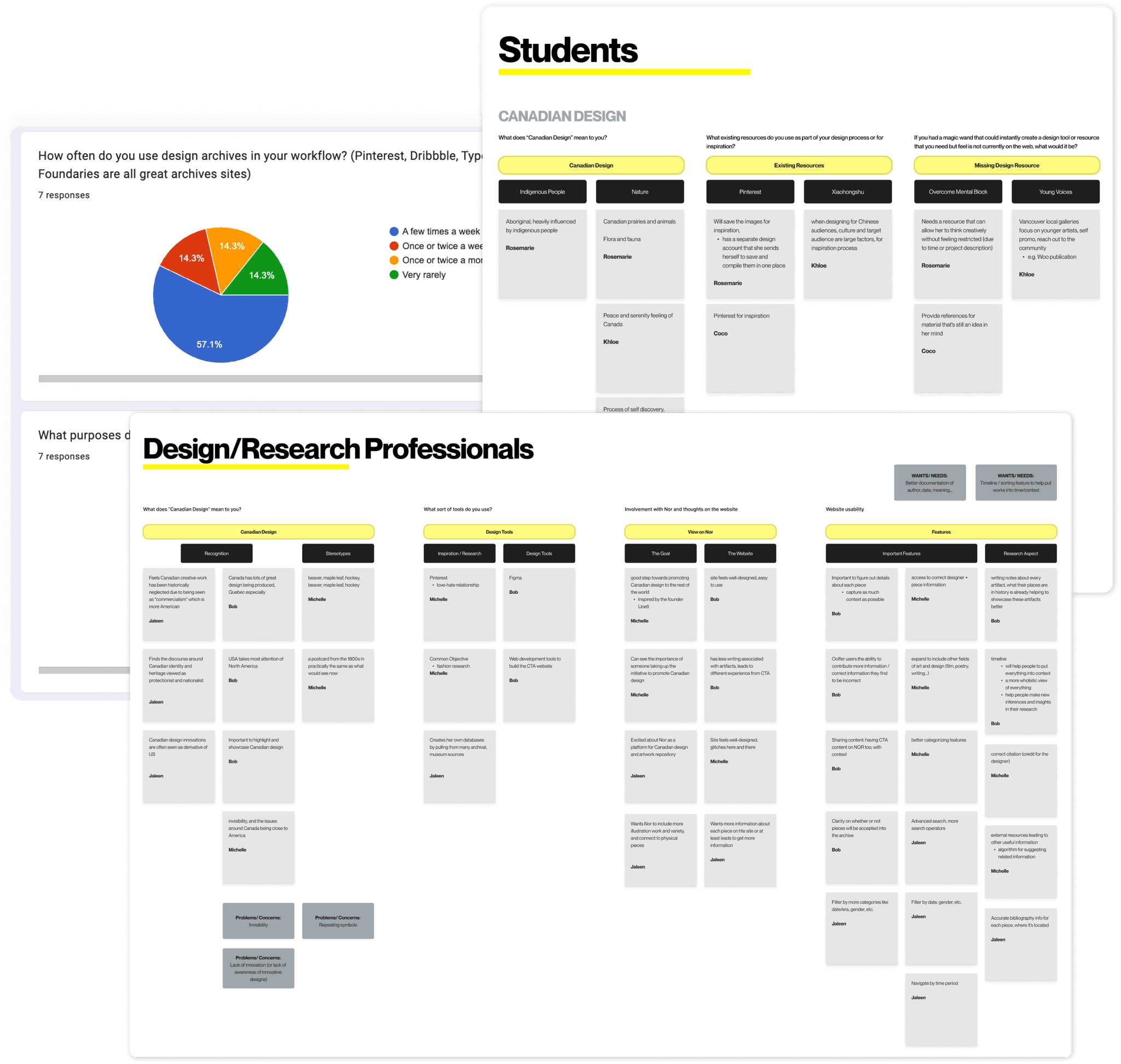
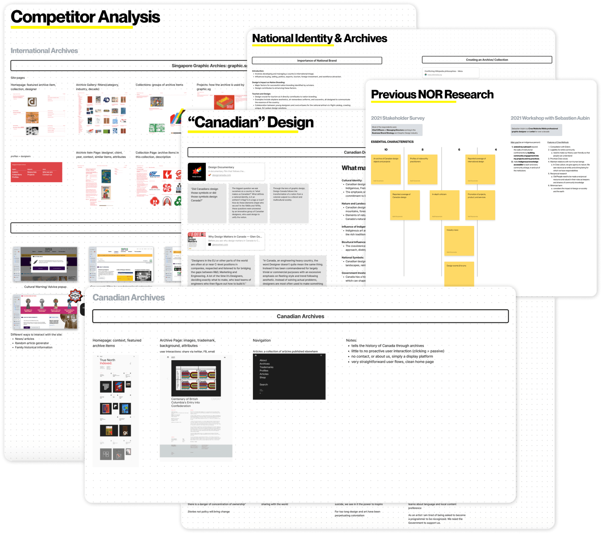
To tackle these primary research goals, we talked to our target users directly through 1) user interviews with 5 members of the Nor network, 2) contextual inquiries with users new to Nor, 3) questionnaires distributed to design & HCI communities. In addition, we conducted a landscape research, consisting of a competitor analysis of 15 other digital archives & design collections, as well as studying existing research on user engagement in Nor and other design archives.
Snapshots of design research
Synthesizing findings with affinity diagraming
Research Insights
The biggest blocker Nor faces in user adoption
Insight 01
Users need to easily recognize a digital archive’s purpose, in order to understand it be a valuable resource for them.
During our contextual inquiries with non-Nor users, we observed a recurring issue where participants experienced initial confusion about the platform's purpose, and remained confused as they continued to browse. One of the most common misunderstandings with thinking that Nor was a marketplace for buying physical designs or hiring freelancers. Moreover, 100% of non-Nor users did not understand what Nor was until we explicitly explained that it was a Canadian digital archive.
First impressions of any tool heavily affect users’ judgement on its value and whether to adopt the tool. Therefore, it is crucial provide a smooth onboarding experience so that users can quickly contextualize and easily recognize the purpose of the archive.
When we asked non-Nor users what they think Nor is after browsing for 3 minutes, they responded:
“Is it introducing different types of design?” [P5]
“What is this, what’s a playlist?” [P2]
“I guess I’m here to buy stuff?” [P2]
“I can’t tell what kinda content lives here ... there’s just so much.” [P7]
A key opportunity in curating content
Insight 02
Inclusivity across different creative mediums and viewpoints can enhance the archive's value and relevance to its audience.
Once we had identified a key barrier to Nor’s adoption, we shifted our focus to understanding the challenges inherent to Nor's content.
Curating content that reflects the multifaceted nature of Canadian design is one of the large opportunities that stands before Nor currently. Not only does it foster a sense of belonging among the archive's audience. But embracing inclusivity across different mediums and viewpoints, can enrich the archive’s value proposition and deepen its connection with users.
Through our interviews and contextual inquiries, we found that participants expressed a keen interest in viewing design work across various mediums, from traditional print to digital interfaces, to understand the full spectrum of creativity that exists within Canadian design.
When we asked participants the value of an archive in forming Canadian design identity, they said:
“There is no singular narrative of Canadian design so being able to capture the multifaceted culture of design is key, especially for our national identity.” [P8]
“Canadian creative work has been historically neglected due to being seen as “commercialism” which is more American, and lacks national awareness.” [P5]
Efficiency & customizability are highly valued
Insight 03
Users prioritize efficient and customizable content discovery when deciding which digital archive to revisit.
Whether seeking specific design mediums, historical periods, or thematic categories, users emphasized the importance of finding what they want, they way they want. This uncovers the need for intuitive tools that allow for efficient retrieval of desired content.
Users communicated a strong desire for enhanced search and filtering capabilities within Nor currently. We aim to innovate new ways to explore digitally, so that our users can interact the way they want. On a similar note, customization also emerged as a key feature. Users sought out flexibility, to tailor their browsing experience to align with their unique interests and preferences. This observation in conjunction with their need for filtering further solidifies the critical role that streamlined content discovery plays in user satisfaction and retention.
When exploring the site, users highlighted the existing gaps that failed to meet their searching needs:
“I want to filter through all this content and find what I’m looking for, fast.” [P5]
“Advanced search features would make Nor much more useful for my research.” [P1]
A common theme that emerged from our competitive analysis: Customizable content discovery with diverse filter options are essential to an engaging user experience.
Contextual exploration + falling down rabbit holes
Insight 04
Facilitating broader contextual exploration is key for improving the experience of browsing an online archive.
Building upon our user’s need for content discovery, they also expressed a desire for richer contextual information about the works they encountered within the design archive. They viewed Nor not only as a repository of inspiration but as a practical research tool. They sought detailed metadata, descriptions, and historical background accompanying each piece; allowing them to better understand its significance, influences, and cultural context.
Insight 05
Exploring related works and falling down rabbit holes is a source of delight for users when using digital archives.
Lastly, we wanted to uncover any aspects of current digital archives that are not meeting needs of users, whether they know it or not.
The most surprising insight was the element of serendipity and the importance is plays in the browsing experience. Users like having the opportunity to stumble upon new works that align with their interests or spark their curiosity.
In our research, users expressed a desire for seamless pathways that enable them to easily find works related to those they're currently viewing. One caveat is that users had different interruptions of what “related” meant, but most agreed that they did not always want to see visually similar works. One user even mentioned the possibility of Nor to become a tool to overcome creative mental blocks simply by browsing and uncovering hidden gems through their journey. By catering to these preferences and designing for both structured exploration and serendipitous discovery, Nor can create engaging and rewarding experiences that resonate deeply with users.
Research Outcomes
“I know exactly what I’m looking for”
→ Prioritizes efficient content discovery [Insight 03]
“I have a general sense of what I want, but
I want to take a look around”
→ Wants inclusivity across different creative mediums and viewpoints [Insight 02]
→ Seeks broader contextual exploration [Insight 04]
“I want to see something random and inspiring”
→ Enjoys exploring related works through “falling down rabbit holes” [Insight 05]
Narrowing down design direction
We found ourselves continually asking. . .
01
How could we make Nor’s purpose more clear?
02
How could we include creative mediums and viewpoints?
03
What could broader contextual exploration look like?
04
How could we nudge users into rabbit holes?
Personas Jobs to be Done
Although we originally planned to create personas to guide our solutions, we ultimately decided to utilize the Jobs to be Done framework, focusing more on motivations and outcomes instead of relying on demographic assumptions and user stereotypes. This anchored our ideation in the unmet needs, goals, and preferences of Nor users.
Based on our research insights, we defined 5 critical jobs:
Find what I want, the way I want
When I’m diving into a specific design topic, I easily find works that match my criteria so I can efficiently conduct my research without needing to scroll or browse for long periods of time.
Explore Canada’s design history
When I’m exploring Canadian design works, I want to visualize works with historical context so I can see how works convey different meaning over time.
Help users create their own meaning
When I’m seeking inspiration, I want to collect and create meaning from multiple works so I can come to new ideas– without needing to export specific works to a third party platform.
Understand the historical significance
When I’m researching a specific design topic, I want to easily understand the historical context so I can design consciously– without possibly erasing other designer’s history.
Visualize other users’ (related) thought patterns
When I’m browsing design works, I want to have other sense-making patterns available so I can see how others connect works together– without getting stuck by my own biases.
Research informed ideation
SCAMPER: Brainstorm from 7 Angles
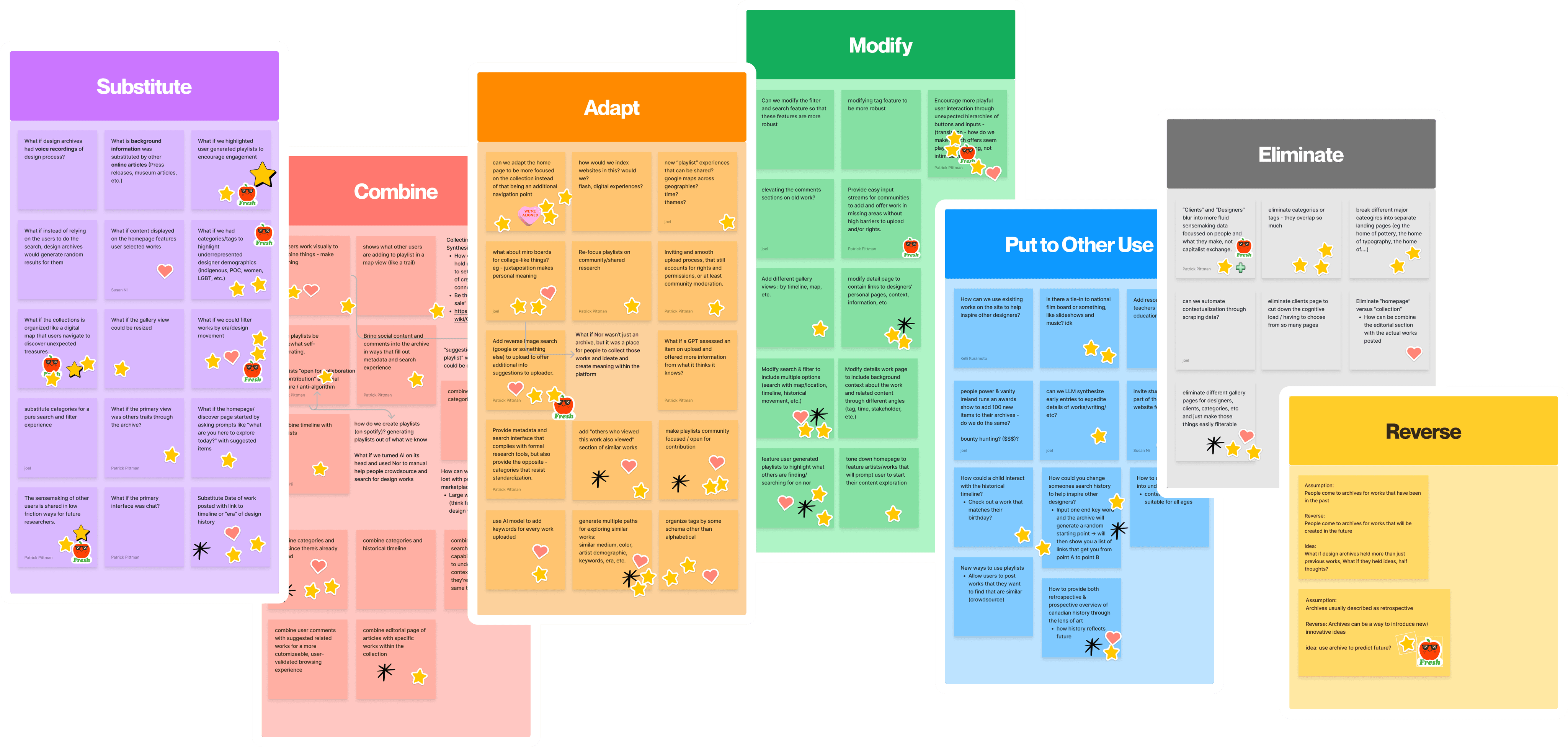
To creatively explore the “jobs” we defined, we implemented the SCAMPER technique — a method that encourages viewing problems through various lenses, including substituting, combining, adapting, modifying, putting to other uses, eliminating, and rearranging components of existing solutions.
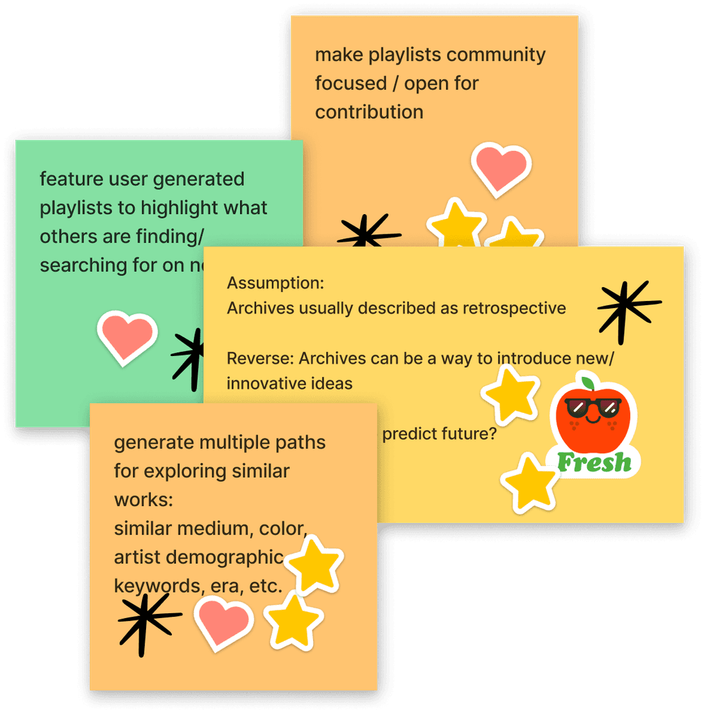
Our team, along with our clients, engaged in collaborative brainstorming sessions where we generated a diverse range of ideas and concepts. Overall, we generated over 50 ideas.
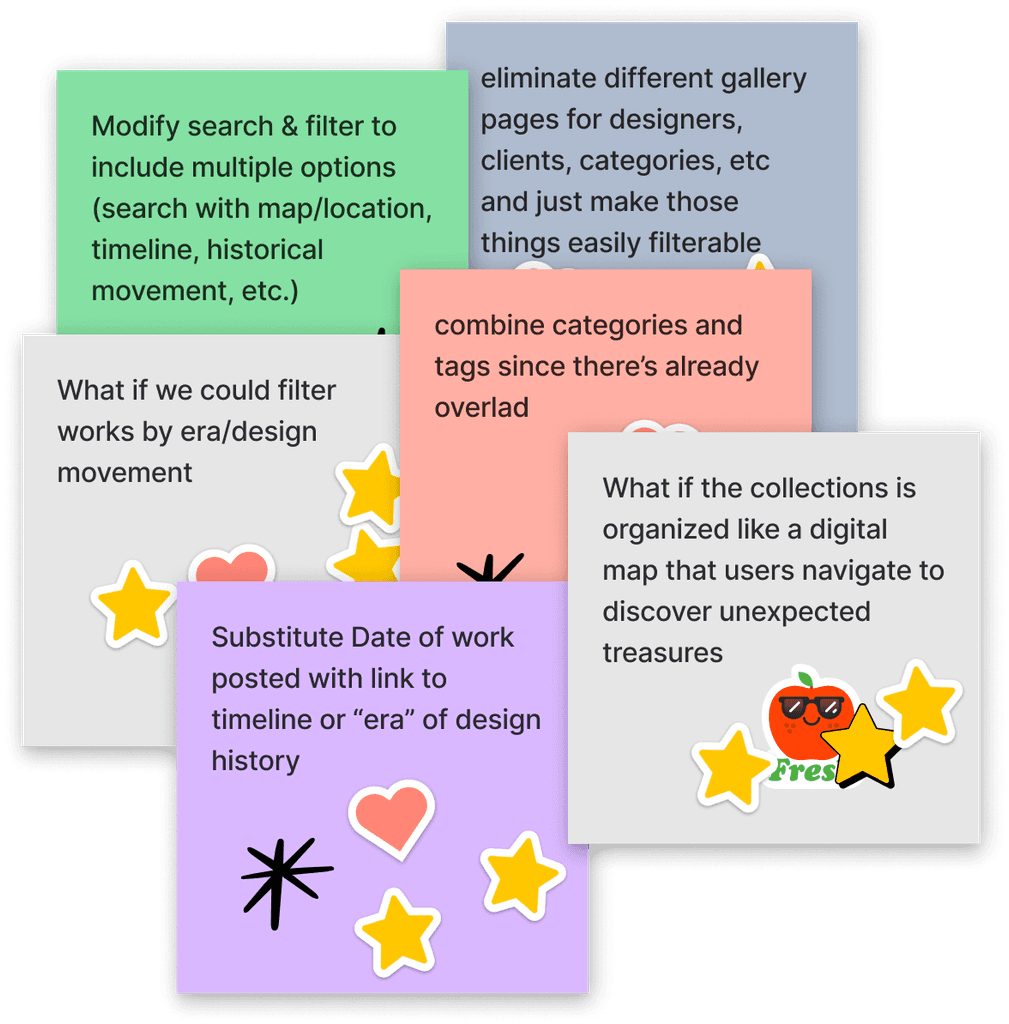
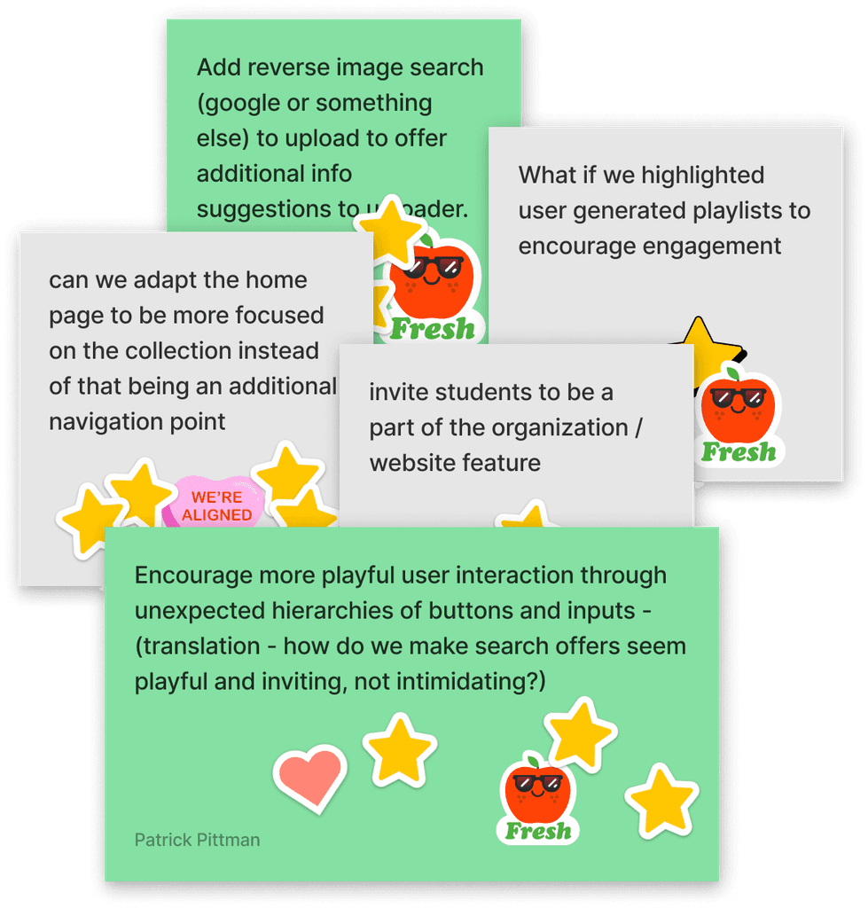
After generating these ideas, we participated in a voting session with our clients to identify the 3 most compelling concepts (below). The top 15 ideas were then visualized through detailed storyboards to capture potential user interactions and the envisioned user journey.
Outcome: New Concept Directions
Enhance the content discovery experience
Represent the archive in novel and interactive ways
Strengthen connections between Nor users and designers
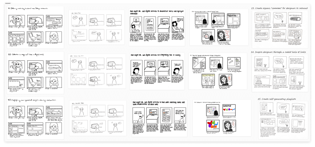
Visualizing with Storyboards + Speed Dating
To quickly validate and iterate on our top 15 ideas, we created storyboards for speed dating. Some ideas included interacting with works through a wide range of attributes like color, typography, and location to help users encounter the unexpected. Another idea was leaving breadcrumbs for other users by tracking user searching habits (e.g. "others are also viewing…").
We then tested the storyboards with 5 participants to validate and narrow our focus for the final design phase.
Speed dating insights
How do users react to these ideas? What are their expectations?
In the speed dating sessions, we discovered that
People are initially drawn to the pretty, shiny things
Users are easily attracted to interactive, cool features they are not familiar with when they first start using a tool. Some participants mentioned moving the cursor on a timeline to reveal works; some recommended word clouds/mind maps, where they can visualize main ideas and click into them to learn more.
Leveraging existing mental models of other archival sites can be beneficial
Users like to see familiar patterns to help them achieve their task. They mentioned how the breadcrumbs concept felt like Amazon's 'more products'.
Users had positive reactions to history or social context for specific works
Participants felt like discovering works in context was key to going a layer deeper than just 'browsing'. They mentioned how "Nor is a great collection, but craves a bit more historical context about how works fit together and where they come from".
The archive should have multiple ways for users to create their own meaning
Across all the ideas on content discovery, we realized that there's no one size fit all solution.
One participant expressed "not sure how we'd be able to create a universal mind map".
Merging and scoping down to 5 concepts
Based on the speed dating insights and prioritizing with impact-effort matrix, we scoped down to 5 concepts for design:
Visualizing works through different storytelling mechanisms
Leaving breadcrumbs of other users sense making & searching patterns
Self-generating playlists of works
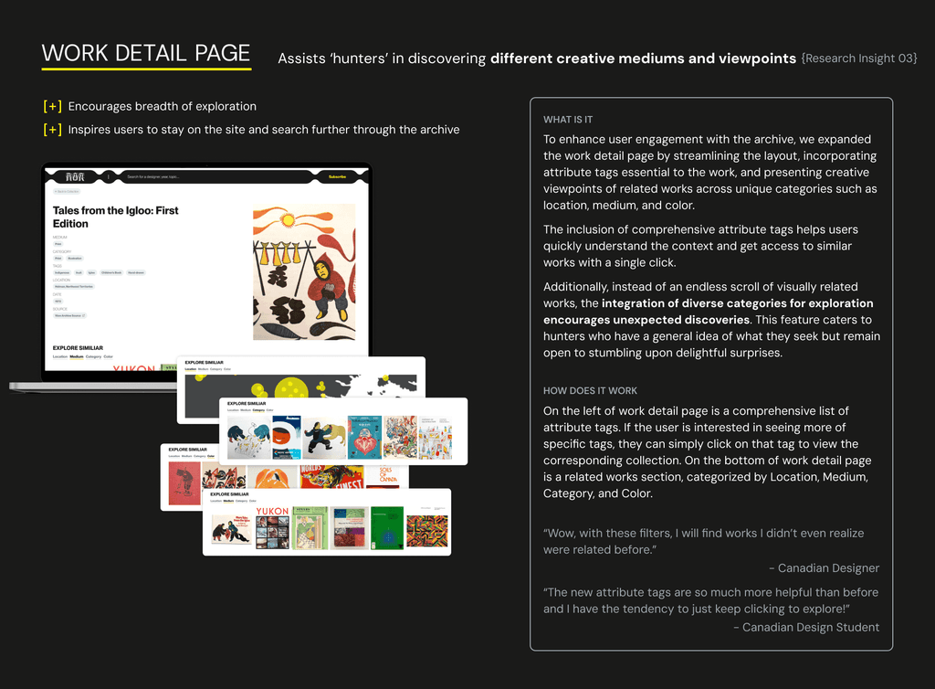
Exploring similar works through multiple paths
Promoting collaboration of user curated playlist of works
Moving into prototyping phase
Crafting features
In the process of prototyping, we focused on the user needs and the two discovery modes: Hunting and Foraging.
In the Hunting mode, users have a general sense of what they want but they want to look around. To achieve this, features emphasize on visualizing collection through different storytelling mechanisms. In Foraging mode, users want "show me something random and inspiring", which makes the goal to sparkle curiosity and exploration with dynamic discovery tools.
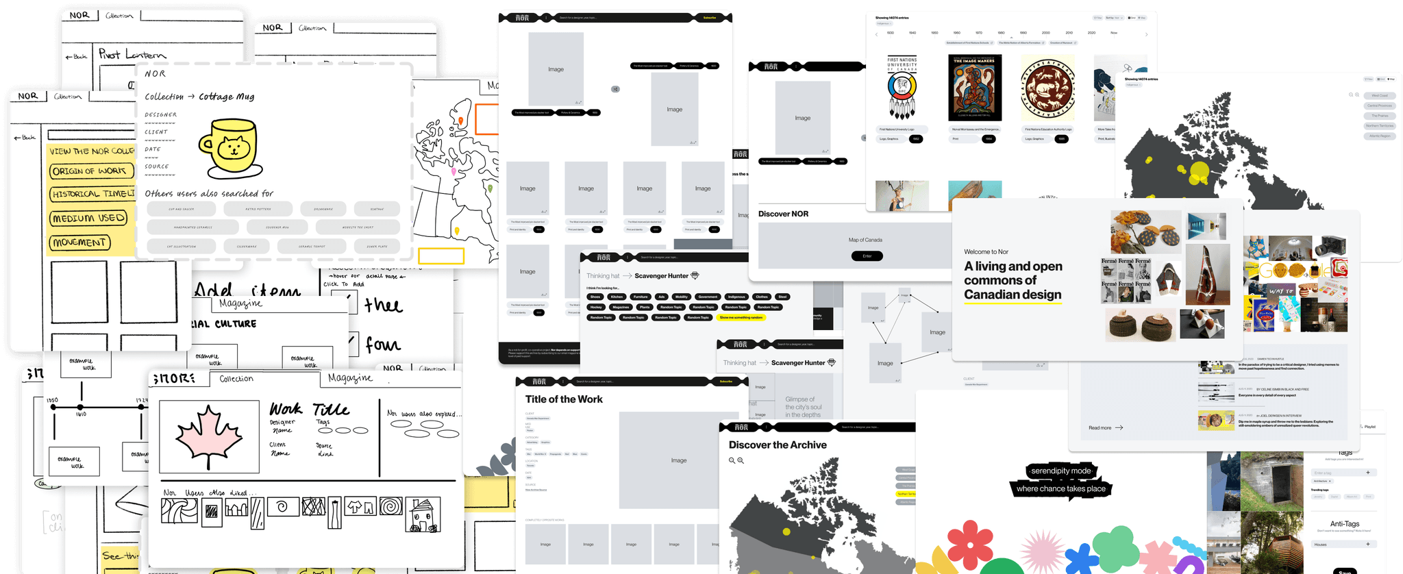
It was tempting to start designing directly in high fidelity as we were already equipped with hi-fi components provided by the client. But in order to “break paradigm of serving more content through a card sort” and aim for a “cohesive, innovative punk idea” as our client suggested, we went back to the drawing board generated the craziest ideas we could think up for storytelling mechanisms and discovery tools.
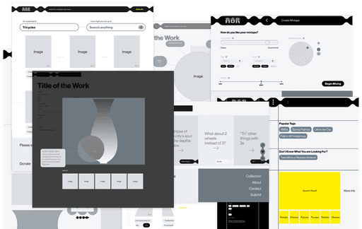
Mid-fi wireframes of our "crazy ideas"
Outcome: Feature Recommendations
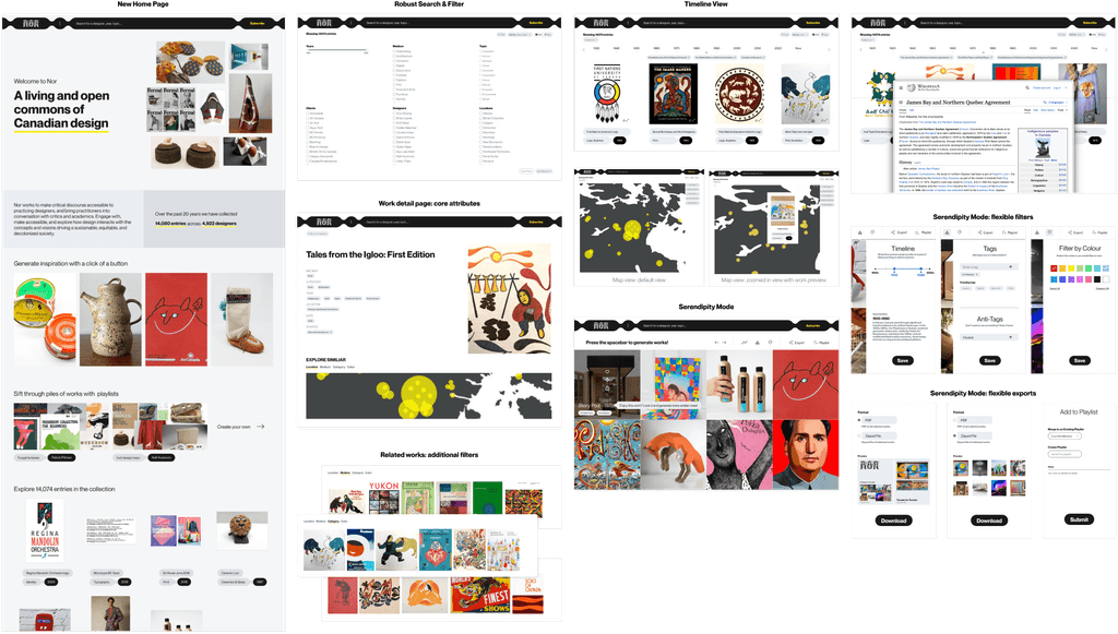
With Mid-fi testing, we identified three features that best met users' needs, as well as a homepage redesign:
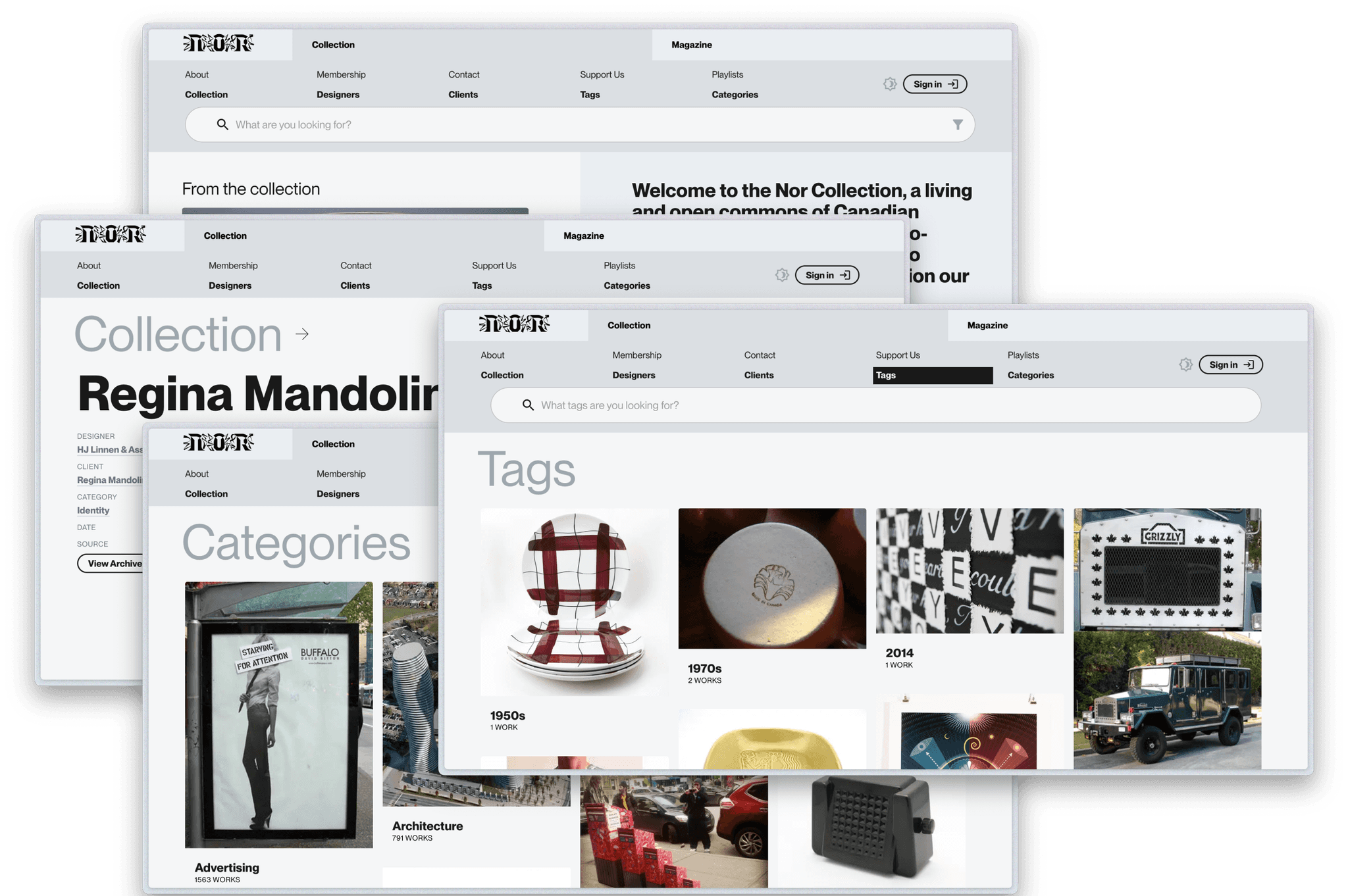
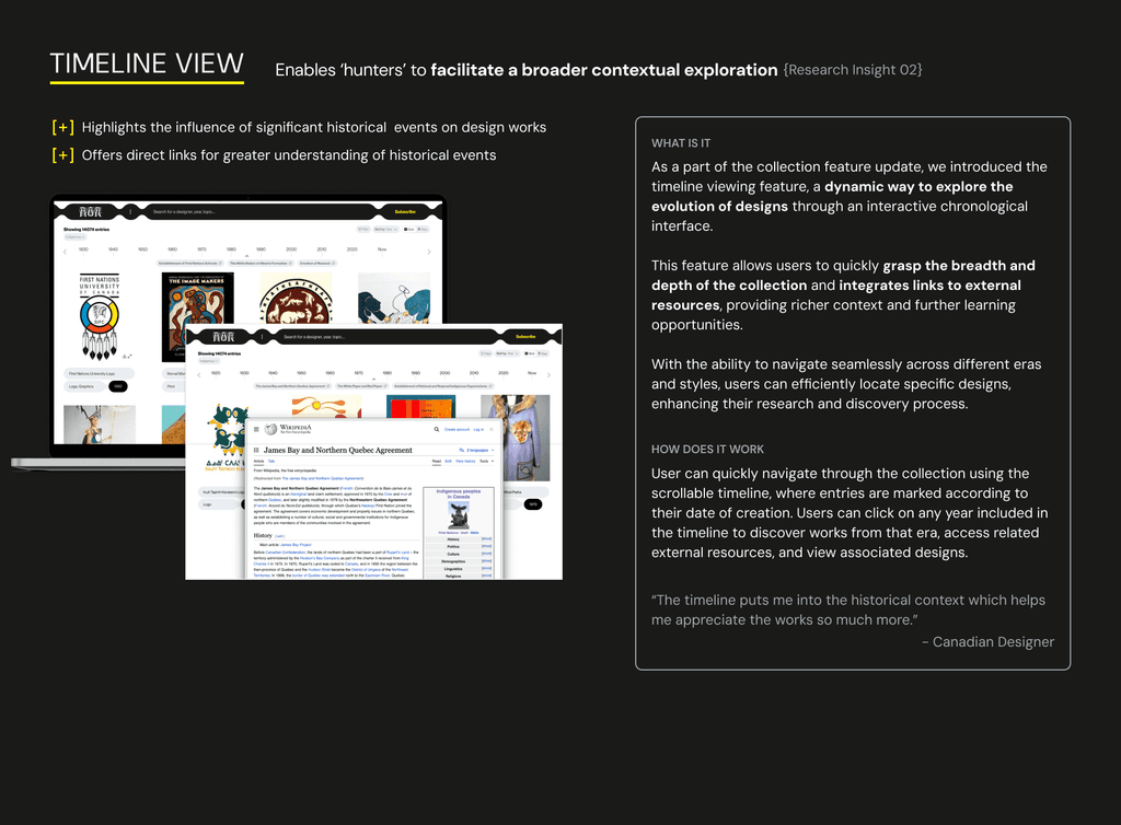
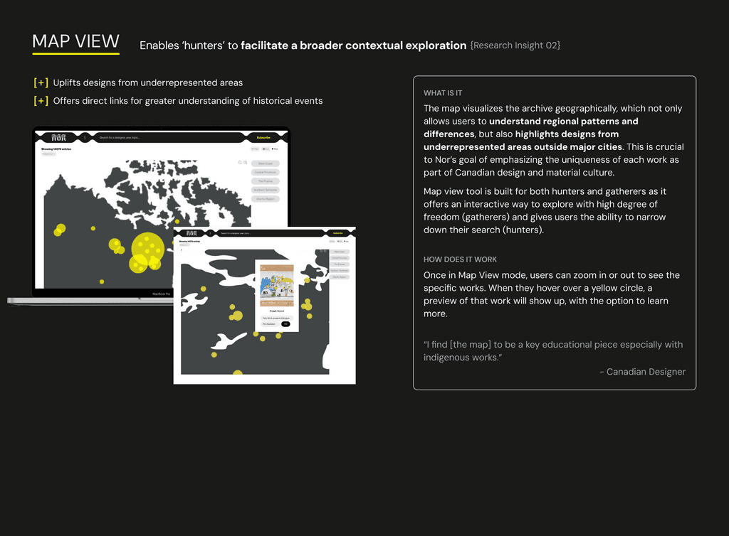
Map & Timeline as alternative view of the Collection page
Work Detail Page with tag-based related works
Serendipity Mode as a dynamic discovery tool
Redesigned homepage to reflect new features
The first two features focus on the Hunting mode, while Serendipity Mode supports Foraging by generating random works with filters.
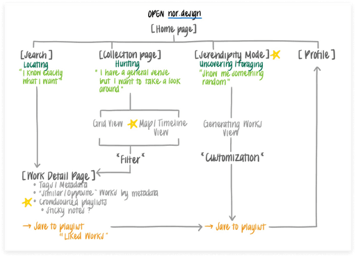
To better understand the entry points of these new features, we visualized them within the existing site map of Nor, highlighting the different paths for our diverse set of target users and the corresponding features.
Integrating new features with current Nor site architecture
Hi-fi Prototype
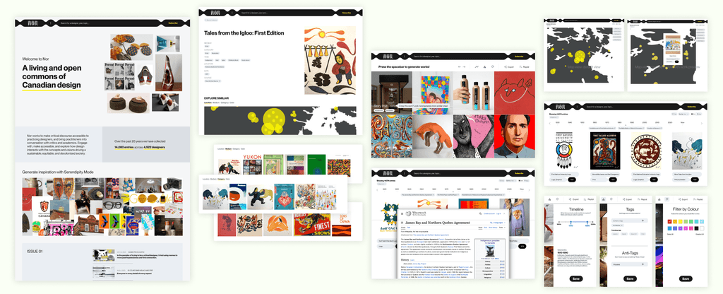
A first look at the new Nor
While designing the new features, we adhered to the brand identity and considered all possible ways of integrating the new features with the existing infrastructure such that no new complexity is added from the user perspective.
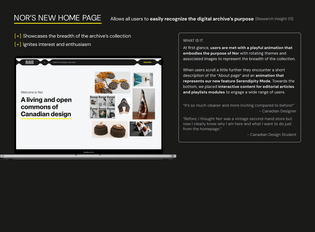
Out of all the screens, homepage was especially emphasized because, as shown in the site map, it is the entry point to several new features and is usually where new users first land. Therefore, our goal for the homepage was to ensure users could easily recognize Nor's purpose and key features.
Hi-fi prototypes
Iteration on Homepage to better capture the new features
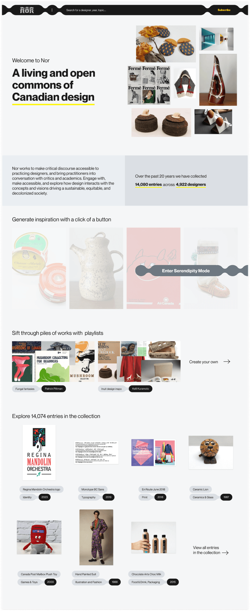
Below is the first iteration of the homepage. It consists of:
Landing (animated)
Introduction to Nor
Serendipity Mode (animated, CTA on hover)
Featured user-created playlists (i.e. works saved by users, like a folder)
Overview of Collection page
List of editorial articles
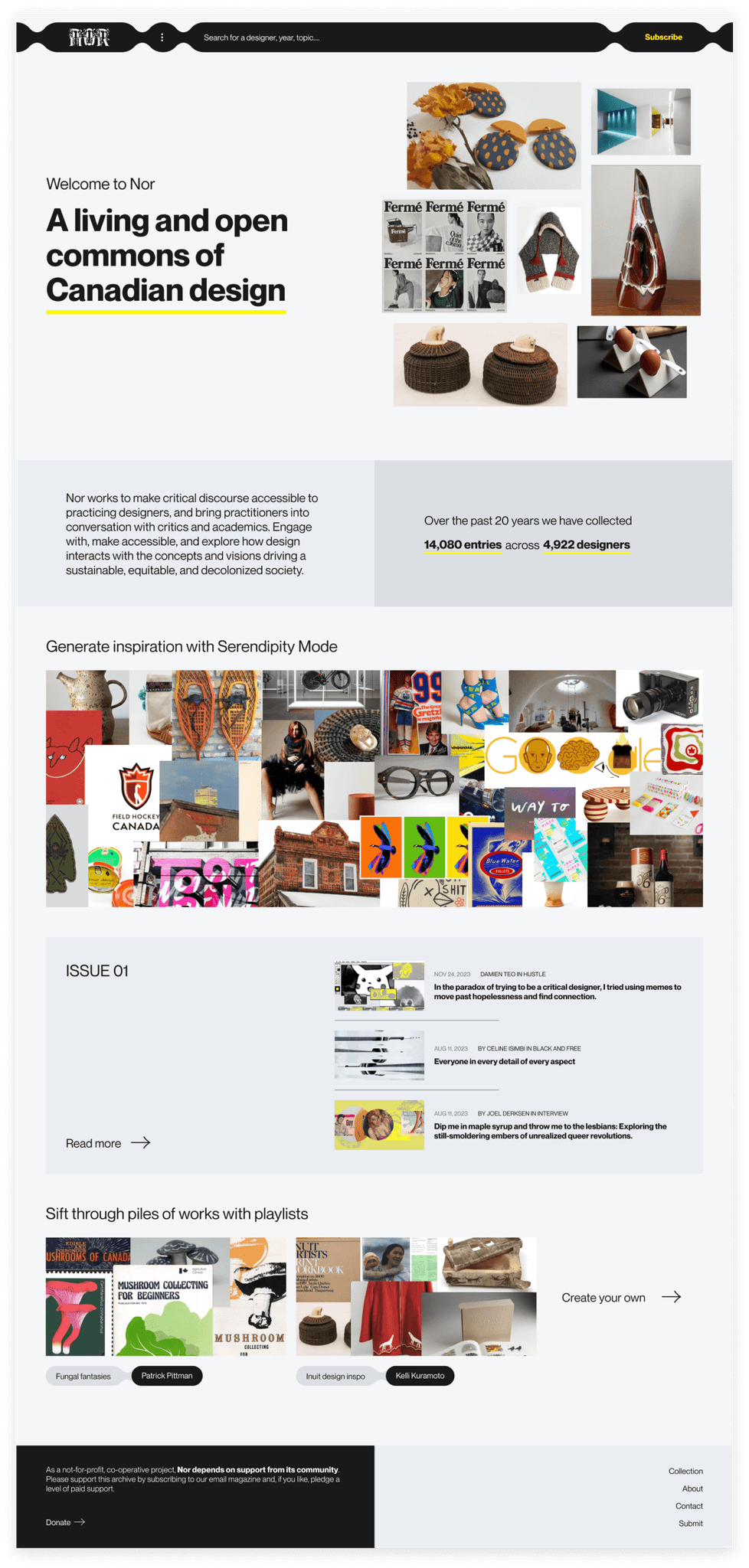
After discussing with our client and getting quick user feedback, we realized that the contents & visual design can be improved by:
Changing the animation for Serendipity Mode to better showcase randomness element of the feature
Highlighting Editorial section with added hover interaction to increase awareness of critical discourse surrounding Canadian design
Removing Collection grid view to reduce repetition
Animated Serendipity Mode + Editorial section
Solution Walkthrough
It's finally time!
With a few more iterations and polishing up the design, we presented to the client of our recommended solution, along with other final deliverables including
Coded prototype demo
Product roadmap - outlines implementation plan (with short term, medium term, and long term goals)
Recommendations doc - helps clients delve deeper into exploring additional concept directions that were identified during research and ideation phases
