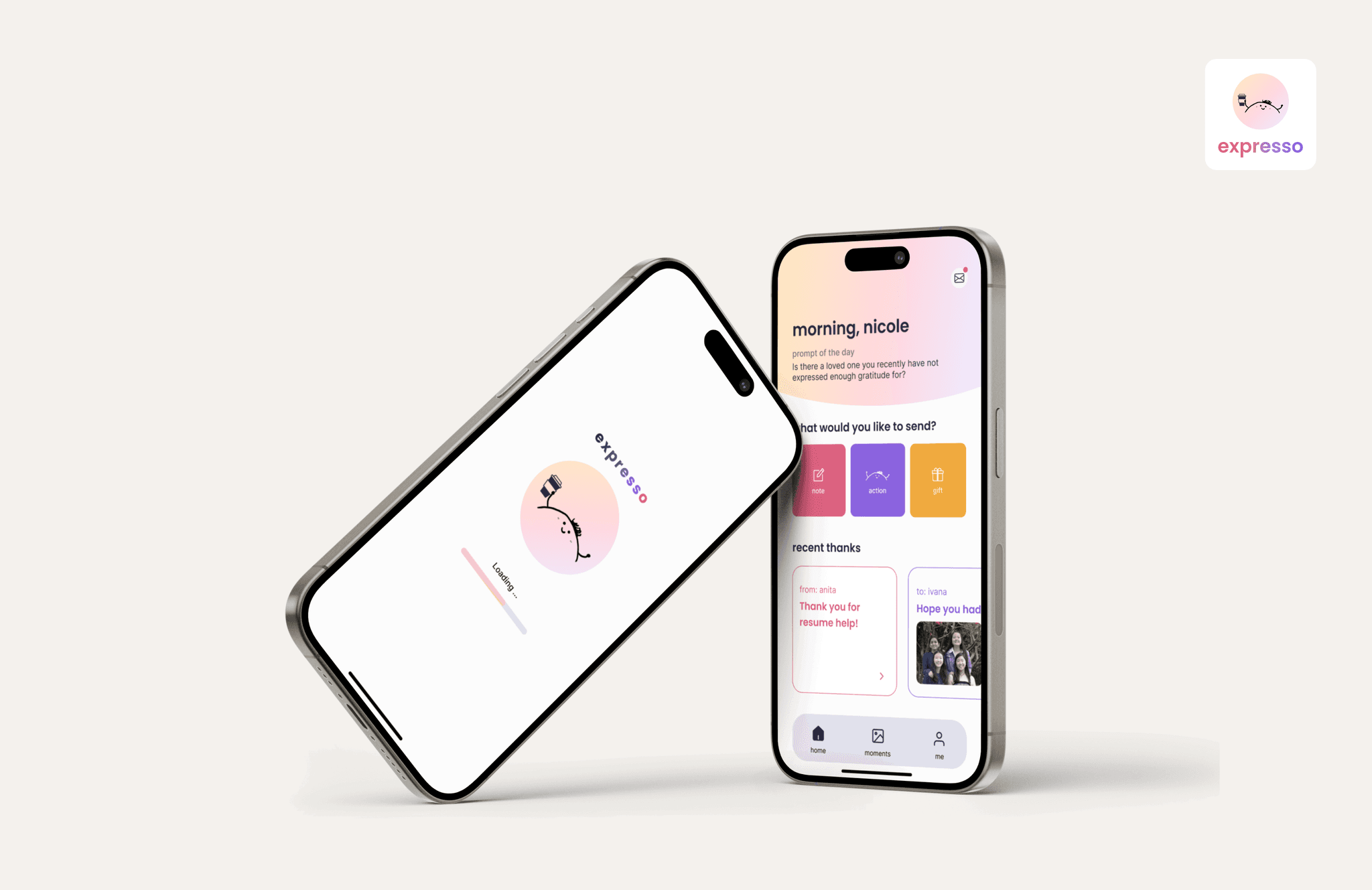


expresso
expresso
Your personalized space for gratitude.
Award Winning Mobile App
Your personalized space for gratitude.
Award Winning Mobile App
Your personalized space for gratitude.
Award Winning Mobile App
Knowing you made someone's day can make yours too. But in today's fast paced world, we often overlook the small moments of appreciation. While it may not seem like such a big issue to forget about these, the benefits that come with fostering this sentiment are widely known in psychology and physical health. However, there's currently no easy way to show casual appreciation, especially across long distances.
For this project, we researched the current state of showing gratitude and designed & built a mobile app aimed to capture moments of appreciation to help connect individuals with their loved ones.
This was part of the course Mobile Application Design and Development, which is sponsored by Capital One and consists of students forming groups to develop their own app over 12 weeks. It includes a contest and cash prize with each team having to give a 15 minute pitch, a demo, and a promo video of their app to Faculty and Sponsors. Our team received first place from Capital One out of 26 teams.
Timeline
Sep - Dec 2022
Role
UX Designer
Frontend Developer
Tools
Figma
Xcode
Google Suite
Team
Ivana Lin
Gloria Moon
Jackie Yang
Nicole Xiang
Role
Role
UX Designer
UX Designer
Frontend Developer
Frontend Developer
Timeline
Timeline
Sep - Dec 2022
Sep - Dec 2022
Tools
Tools
Figma
Figma
Xcode
Xcode
Google Suite
Google Suite
Team
Team
Ivana Lin
Ivana Lin
Gloria Moon
Gloria Moon
Jackie Yang
Jackie Yang
Nicole Xiang
Nicole Xiang
Overview
Problem
How might we help people feel connected both virtually and casually?
Outcome
We designed & developed a gratitude app that allows users to express appreciation through personal thank you notes, small gifts and virtual hugs & hearts.
The Journey
From an idea to an app in 12 weeks
After 6 sprints of design and development, we produced wireframes with all fidelity, a fully functional iOS mobile app, a pitch, and demo video.
01 Getting the right idea
01 Getting the right idea
Research & Brainstorm
The team did online research on the effect of expressing and receiving appreciation, as well as a survey study with 15 participants on their experience with showing gratitude.
Research & Brainstorm
The team did online research on the effect of expressing and receiving appreciation, as well as a survey study with 15 participants on their experience with showing gratitude.
Research & Brainstorm
The team did online research on the effect of expressing and receiving appreciation, as well as a survey study with 15 participants on their experience with showing gratitude.
02 Communicating through design
02 Communicating through design
02 Communicating through design
Design & User Testing
I designed all low & high fidelity wireframes, performed user testing on them and iterated. A design system was also created for better consistency and easier development process.
Design & User Testing
I designed all low & high fidelity wireframes, performed user testing on them and iterated. A design system was also created for better consistency and easier development process.
Design & User Testing
I designed all low & high fidelity wireframes, performed user testing on them and iterated. A design system was also created for better consistency and easier development process.
03 Bringing design to life
03 Bringing design to life
03 Bringing design to life
Development & Usability Testing
I built the frontend part of the app with Gloria while others worked on the backend. Once we reached MVP, we conducted usability testing to finalize any changes required.
Development & Usability Testing
I built the frontend part of the app with Gloria while others worked on the backend. Once we reached MVP, we conducted usability testing to finalize any changes required.
Development & Usability Testing
I built the frontend part of the app with Gloria while others worked on the backend. Once we reached MVP, we conducted usability testing to finalize any changes required.
04 Packaging the product
04 Packaging the product
04 Packaging the product
Deployment & Pitch
One final key component of the project is the app demo video and the pitch, which explained what the app does, the values, and our process.
Deployment & Pitch
One final key component of the project is the app demo video and the pitch, which explained what the app does, the values, and our process.
Deployment & Pitch
One final key component of the project is the app demo video and the pitch, which explained what the app does, the values, and our process.
Setting Expectation
What to expect for this project?
01
01
01
Applying Product Thinking
We weren't just making an app, we were building a product. So this includes finding the product market fit, value proposition, and how we differentiate ourselves.
Applying Product Thinking
We weren't just making an app, we were building a product. So this includes finding the product market fit, value proposition, and how we differentiate ourselves.
Applying Product Thinking
We weren't just making an app, we were building a product. So this includes finding the product market fit, value proposition, and how we differentiate ourselves.
02
02
02
Design x Development
One challenge I encountered as a designer is the technical feasibility given our timeline. We prioritized features and did design reviews to evaluate what was possible.
Design x Development
One challenge I encountered as a designer is the technical feasibility given our timeline. We prioritized features and did design reviews to evaluate what was possible.
Design x Development
One challenge I encountered as a designer is the technical feasibility given our timeline. We prioritized features and did design reviews to evaluate what was possible.
03
03
03
Exploring App Development
One of my biggest accomplishments with Expresso is learning Swift & Xcode. I also understood what it takes to develop an app and what makes a successful app.
Exploring App Development
One of my biggest accomplishments with Expresso is learning Swift & Xcode. I also understood what it takes to develop an app and what makes a successful app.
Exploring App Development
One of my biggest accomplishments with Expresso is learning Swift & Xcode. I also understood what it takes to develop an app and what makes a successful app.
Research & Ideation
When saying "thank you" turns into a habit, it becomes such a normalized act of affection that we start to forget these moments
of gratitude.
When saying "thank you" turns into a habit, it becomes such a normalized act of affection that we start to forget these moments of gratitude.
"I never consciously thought about thanking people this much unless it's a huge favor."
"I never consciously thought about thanking people this much unless it's a huge favor."
"I never consciously thought about thanking people this much unless it's a huge favor."
In our research on user pain points, we found out that
There's a lack of casual & virtual appreciation.
There is currently no easy way to show casual appreciation, especially across long distances. While text messages keep people connected, people want something more personal and intimate that can show effort and meaning towards the relationship.
There's a lack of casual & virtual appreciation.
There is currently no easy way to show casual appreciation, especially across long distances. While text messages keep people connected, people want something more personal and intimate that can show effort and meaning towards the relationship.
There's a lack of casual & virtual appreciation.
There is currently no easy way to show casual appreciation, especially across long distances. While text messages keep people connected, people want something more personal and intimate that can show effort and meaning towards the relationship.
There's a lack of casual & virtual appreciation.
There is currently no easy way to show casual appreciation, especially across long distances. While text messages keep people connected, people want something more personal and intimate that can show effort and meaning towards the relationship.
Gifting money is seen as a taboo.
When it comes to giving gift cards or money as a token of appreciation, there is a taboo around since there is too much emphasis on the financial value or specific dollar amount.
Gifting money is seen as a taboo.
When it comes to giving gift cards or money as a token of appreciation, there is a taboo around since there is too much emphasis on the financial value or specific dollar amount.
Gifting money is seen as a taboo.
When it comes to giving gift cards or money as a token of appreciation, there is a taboo around since there is too much emphasis on the financial value or specific dollar amount.
Gifting money is seen as a taboo.
When it comes to giving gift cards or money as a token of appreciation, there is a taboo around since there is too much emphasis on the financial value or specific dollar amount.
People are too busy.
People are often too busy and consumed in their everyday activities to remember to say thank you to those around them.
People are too busy.
People are often too busy and consumed in their everyday activities to remember to say thank you to those around them.
People are too busy.
People are often too busy and consumed in their everyday activities to remember to say thank you to those around them.
People are too busy.
People are often too busy and consumed in their everyday activities to remember to say thank you to those around them.
There's no record of all appreciations.
People don’t have an easy way to view all their past appreciations in one place.
There's no record of all appreciations.
People don’t have an easy way to view all their past appreciations in one place.
There's no record of all appreciations.
People don’t have an easy way to view all their past appreciations in one place.
There's no record of all appreciations.
People don’t have an easy way to view all their past appreciations in one place.
Breaking Down the Product
We want to make a successful app
To reach this goal, we evaluated our idea using 3 metrics: 1) desirability 2) feasibility 3) viability, which then led us to narrow down on our target audience, value proposition, and key features.
01
01
01
Target Audience
While anyone can use this app, we primarily see the target users of the app to be young adults who want to express gratitude and who want to connect with friends & family, as well as those that are long distance from each other.
Target Audience
While anyone can use this app, we primarily see the target users of the app to be young adults who want to express gratitude and who want to connect with friends & family, as well as those that are long distance from each other.
Target Audience
While anyone can use this app, we primarily see the target users of the app to be young adults who want to express gratitude and who want to connect with friends & family, as well as those that are long distance from each other.
02
02
02
Values
Values
Values
Casual & virtual appreciation
The app provides an easy way to show casual appreciation anywhere, anytime, in any form from the convenience of your phone.
Casual & virtual appreciation
The app provides an easy way to show casual appreciation anywhere, anytime, in any form from the convenience of your phone.
Casual & virtual appreciation
The app provides an easy way to show casual appreciation anywhere, anytime, in any form from the convenience of your phone.
Feelings of Delight.
The app is designed for social interactions that create moments of delight for both the sending & receiving party.
Capturing all Moments of Appreciation
The Gratitude Gallery provides users with a collection of appreciations between friends and family, all in one place.
Casual & virtual appreciation
The app provides an easy way to show casual appreciation anywhere, anytime, in any form from the convenience of your phone.
Feelings of Delight
The app is designed for social interactions that create moments of delight for both the sending & receiving party.
Feelings of Delight
The app is designed for social interactions that create moments of delight for both the sending & receiving party.
Feelings of Delight
The app is designed for social interactions that create moments of delight for both the sending & receiving party.
Capturing all Moments of Appreciation
The Gratitude Gallery provides users with a collection of appreciations between friends and family, all in one place.
Capturing all Moments of Appreciation
The Gratitude Gallery provides users with a collection of appreciations between friends and family, all in one place.
Capturing all Moments of Appreciation
The Gratitude Gallery provides users with a collection of appreciations between friends and family, all in one place.
03
03
03
The Mobile Mindset
The goal of the app is for users to engage in sending small focused moments of "thank you" through notes & gifts using your phone to anyone in the world. The app also takes advantage of microinteractions with swiping & tapping to keep users engaged.
The Mobile Mindset
The goal of the app is for users to engage in sending small focused moments of "thank you" through notes & gifts using your phone to anyone in the world. The app also takes advantage of microinteractions with swiping & tapping to keep users engaged.
The Mobile Mindset
The goal of the app is for users to engage in sending small focused moments of "thank you" through notes & gifts using your phone to anyone in the world. The app also takes advantage of microinteractions with swiping & tapping to keep users engaged.
Visualizing the Idea
Parallel design is key to a collaborative design process.
To kickoff the design process, we followed the parallel design technique where we all did our own sketches and discussed how we could merge elements. Thought we ended up using my design for further development, seeing other people's designs really inspired me.
Wireframing
Having a big picture of app capabilities guided my wireframes.
Because there were so many features, I mapped out how users would interact with each and the order of these. This solidified my understanding of what had to be designed.
Because there were so many features, I mapped out how users would interact with each and the order of these. This solidified my understanding of what had to be designed.
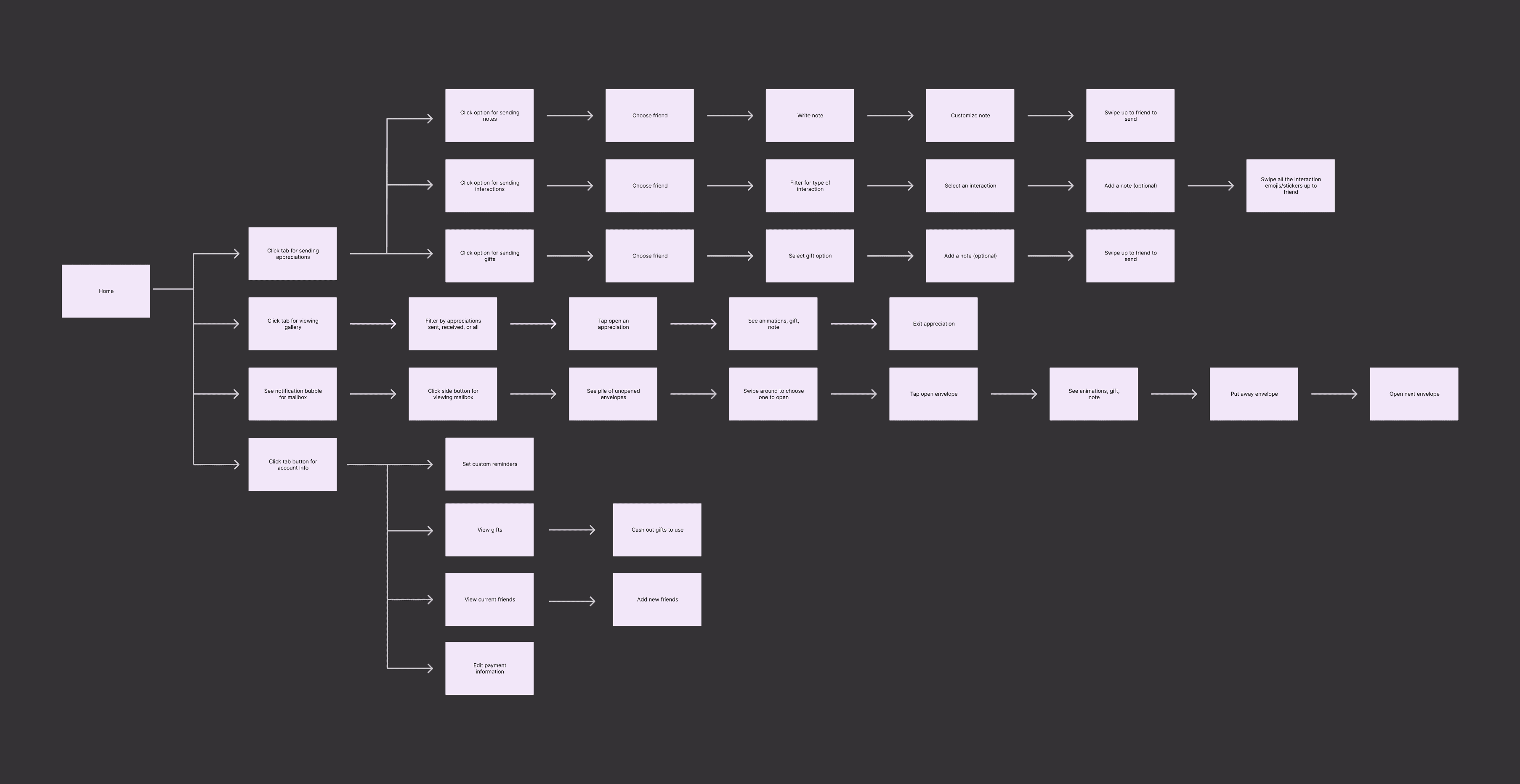
User Flow
To understand exactly what we are designing, we created a complete user flow of all the in-app interactions.
This helped identify design priorities and map out code structure at a high level.
User Flow
To understand exactly what we are designing, we created a complete user flow of all the in-app interactions.
This helped identify design priorities and map out code structure at a high level.
User Flow
To understand exactly what we are designing, we created a complete user flow of all the in-app interactions.
This helped identify design priorities and map out code structure at a high level.
User Flow
To understand exactly what we are designing, we created a complete user flow of all the in-app interactions.
This helped identify design priorities and map out code structure at a high level.


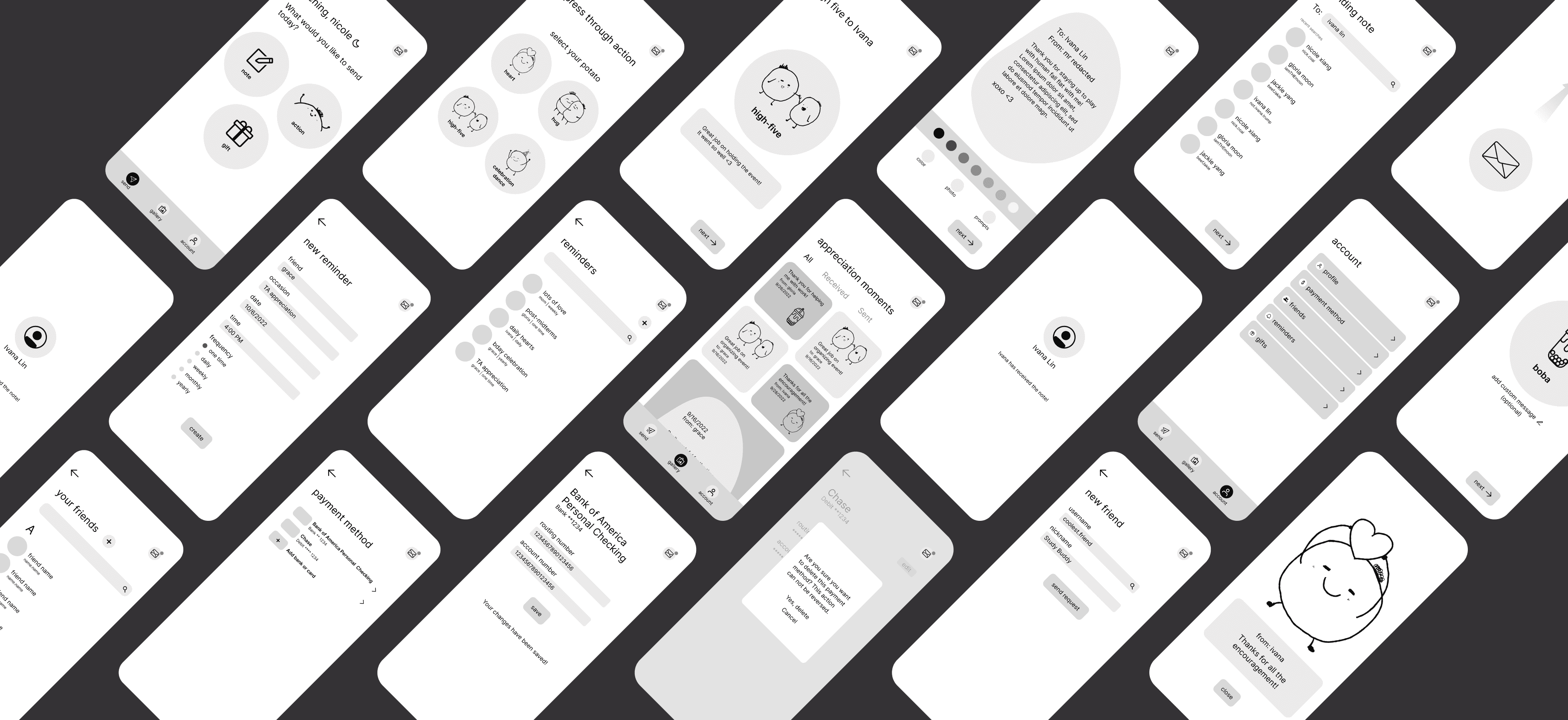
Low Fidelity Wireframes
With the user flow mapped out, Jackie and I created lo-fi wireframes that capture all main feataures for user testing.
Testing & Iteration
Answering "how intuitive are the interactions" with usability testing & iterations.
We conducted small usability testing with 4 users to gauge if the flow of the app and the intended user interactions were intuitive. We also aimed to understand what the highest priority features and the nice to have features were with user feedback.
Before
Users feel like there are too many next buttons. This adds more steps for user to get one task done. Participants also said that they thought clicking "next" is finalizing a task (a sticker/note would be sent directly).
Before
Users feel like there are too many next buttons. This adds more steps for user to get one task done. Participants also said that they thought clicking "next" is finalizing a task (a sticker/note would be sent directly).
After
To address this, interactions have been automated where appropriate. Extraneous "next" buttons have also been removed but still remain for tasks that require users to finalize their input (i.e. writing a message).
After
To address this, interactions have been automated where appropriate. Extraneous "next" buttons have also been removed but still remain for tasks that require users to finalize their input (i.e. writing a message).
Before
Users feel like there are too many next buttons. This adds more steps for user to get one task done. Participants also said that they thought clicking "next" is finalizing a task (a sticker/note would be sent directly).
After
To address this, interactions have been automated where appropriate. Extraneous "next" buttons have also been removed but still remain for tasks that require users to finalize their input (i.e. writing a message).
Before
All 4 users weren't clear about what to do on this screen. They learned that this is a swipe action for later tasks but the first-time experience was confusing without instruction.
Before
All 4 users weren't clear about what to do on this screen. They learned that this is a swipe action for later tasks but the first-time experience was confusing without instruction.
After
To create affordance that this is a swipe action and to eliminate the gulf of evaluation, I added animated arrows pointing up and a note to swipe up.
After
To create affordance that this is a swipe action and to eliminate the gulf of evaluation, I added animated arrows pointing up and a note to swipe up.
Before
All 4 users weren't clear about what to do on this screen. They learned that this is a swipe action for later tasks but the first-time experience was confusing without instruction.
After
To create affordance that this is a swipe action and to eliminate the gulf of evaluation, I added animated arrows pointing up and a note to swipe up.
Before
Users didn't realize that the "$" icons were clickable and that gifts costed money. They would still pay but were a little surprised when they saw the price at the end.
Before
Users didn't realize that the "$" icons were clickable and that gifts costed money. They would still pay but were a little surprised when they saw the price at the end.
After
To ensure 100% transparency, we displayed the monetary amount directly. Users would see this before completing the transaction. We also included the option to change the payment method.
After
To ensure 100% transparency, we displayed the monetary amount directly. Users would see this before completing the transaction. We also included the option to change the payment method.
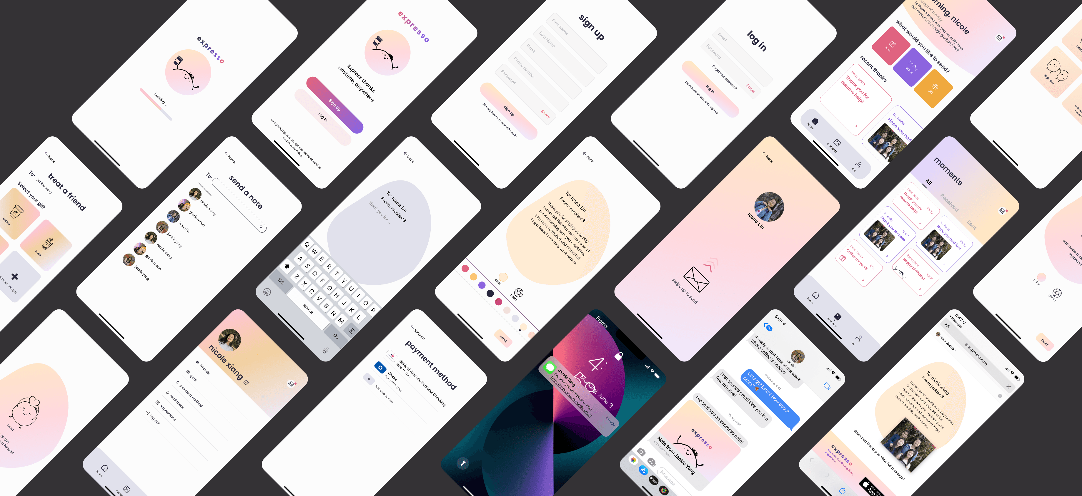
Hi-fi
Final Iterations & Hi-fi Wireframes
After implementing all the user testing feedback, I revised all hi-fi wireframes and completed design handoff.
Design System
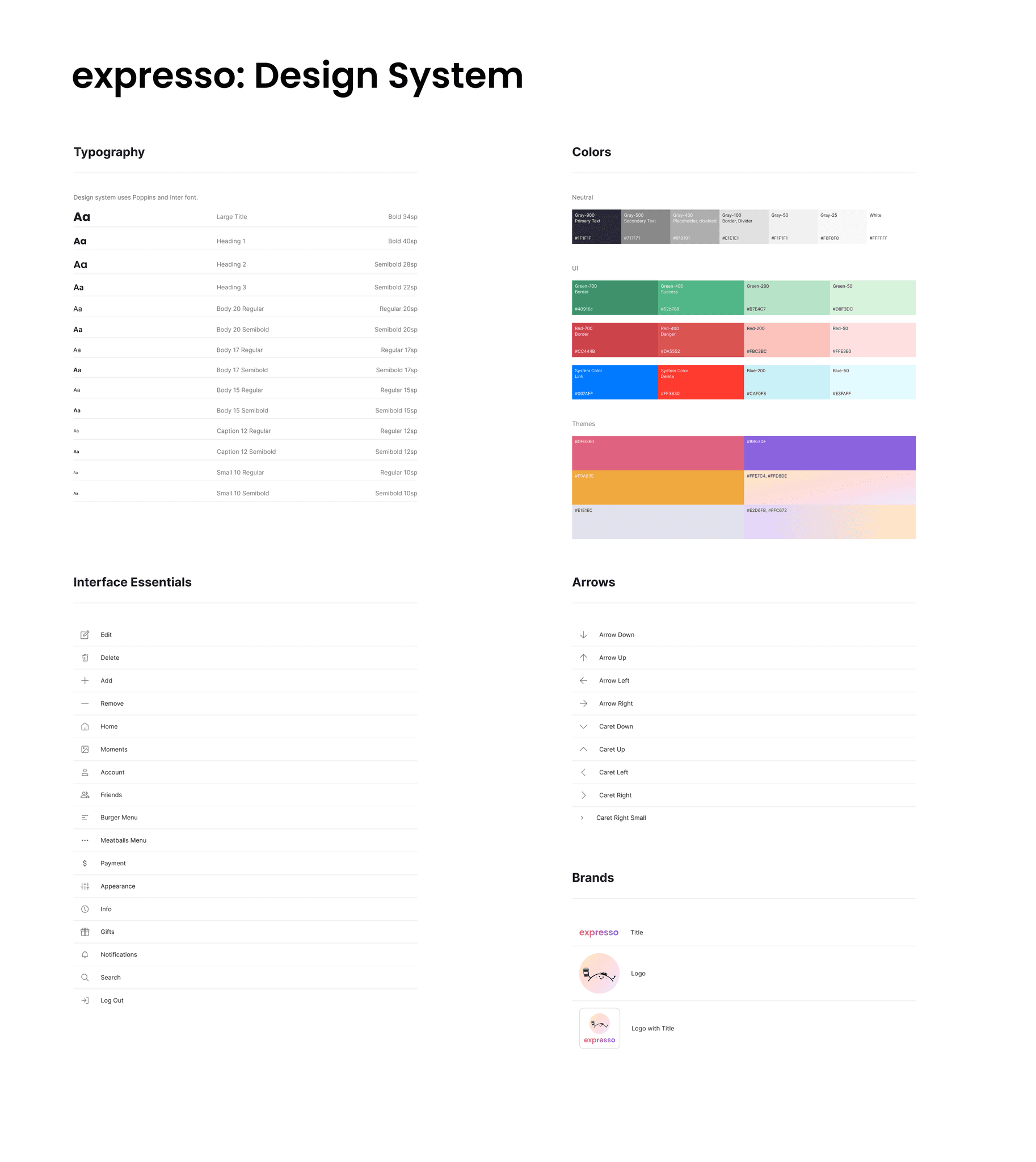
Building a brand kit that sets the tone for gratitude.
One key goal of the app is for users to feel welcomed, heartfelt and safe to express themselves. And colors are the most direct way to create such an environment. After conducting user interviews, we revisted our original style guide and rebranded expresso.
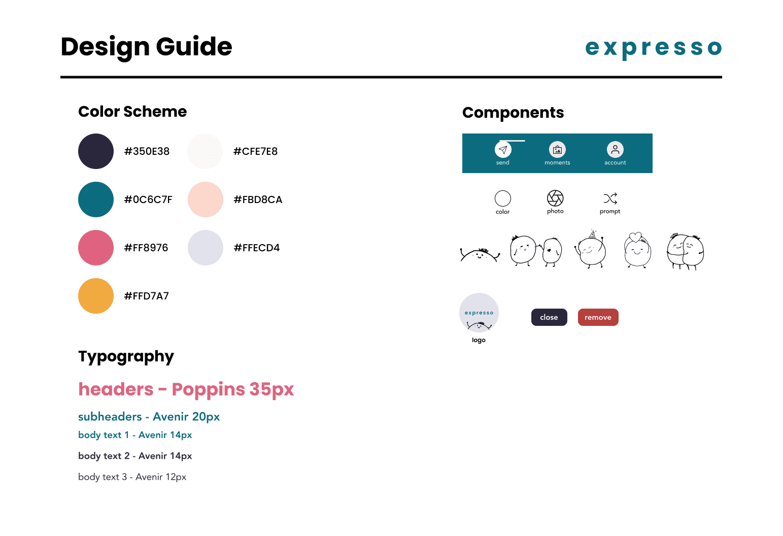
Original Brand Guide
We learned that the fonts and components helped create feelings of delight and warmness, but the colors (especially, dark turquoise) weigh everything down a bit. So we went through another iteration of branding.


Revised Brand Kit
click on arrows to see more
Design System


Development
Design to Code from Scratch
This is the longest phase of the project — 2 weeks to implement a MVP version, another 2 weeks to implement usability testing feedback for final app. We split the work into frontend, backend, and API. Jackie, Gloria and I worked on the frontend together because there were so many screens.
This is the longest phase of the project — 2 weeks to implement a MVP version, another 2 weeks to implement usability testing feedback for final app. We split the work into frontend, backend, and API. Jackie, Gloria and I worked on the frontend together because there were so many screens.
Mapping Out the Data
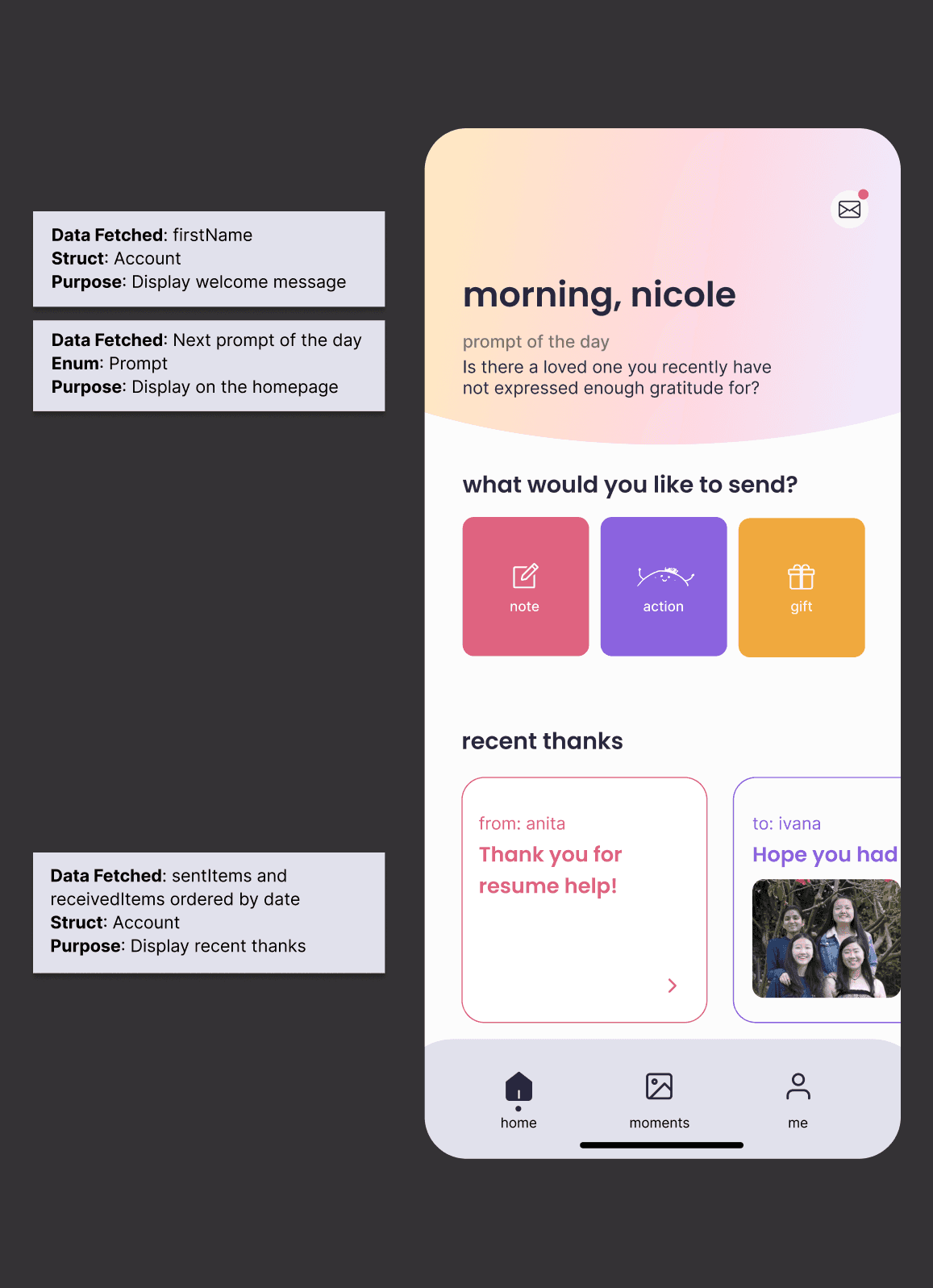
To help translate design to code, we mapped out all the data needed according to thehi-fi wireframes. On the bottom is an example what it looks like.
Mapping Out the Data
To help translate design to code, we mapped out all the data needed according to thehi-fi wireframes. On the bottom is an example what it looks like.
Mapping Out the Data
To help translate design to code, we mapped out all the data needed according to thehi-fi wireframes. On the bottom is an example what it looks like.


Priotizing Use Cases
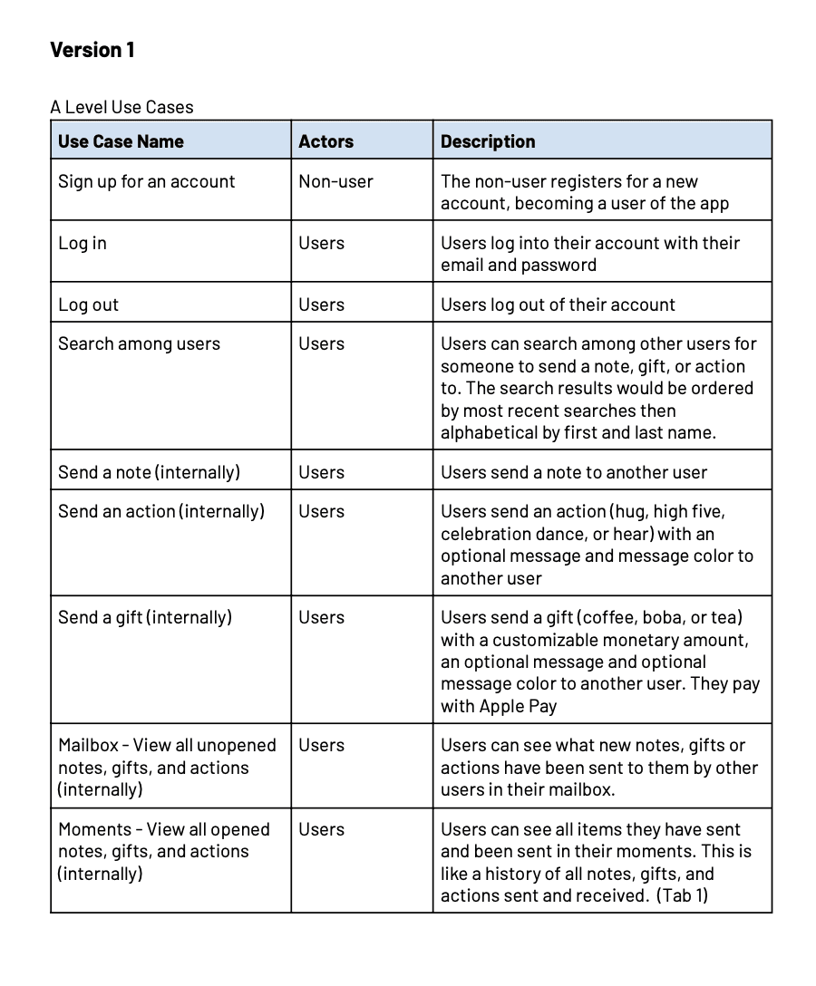
In order to reach MVP within the timeframe, we prioritized features based on user testing feedback and created "must have" and "nice to have" categories.
Priotizing Use Cases
In order to reach MVP within the timeframe, we prioritized features based on user testing feedback and created "must have" and "nice to have" categories.
Priotizing Use Cases
In order to reach MVP within the timeframe, we prioritized features based on user testing feedback and created "must have" and "nice to have" categories.


Coding in Swift
This was the most challenging phase of the entire project as we had to code the app from the ground up. However, with this experience, I learned development language, Swift, the technical structure behind an app, and how to collaborate effectively using GitHub.
Below is a short video of what it was like working with XCode.
Learnings
Reflecting on the Project
This project is my first time creating a mobile app so it was definitely a very challenging but fulfilling experience. I'm grateful for my amazing team members and all the help we received from TAs & professor.
01
01
01
Vision vs Reality
Because there's the implementation part of the project, I had to keep in mind the technical feasibility as I was designing. There were features that were in the wireframes but didn't make to implementation. This broadened my perspective on how as a designer, you need to consider more than just the Figma file but also the full development cycle of a product.
02
02
02
Use Case Prioritization
Working with my team members (whose roles were PM & SWE), I got new perspectives on how differently we think from our role. There were times I'd prioritize one feature, but something else would have higher priority from development side.
Use Case Prioritization
Working with my team members (whose roles were PM & SWE), I got new perspectives on how differently we think from our role. There were times I'd prioritize one feature, but something else would have higher priority from development side.
Use Case Prioritization
Working with my team members (whose roles were PM & SWE), I got new perspectives on how differently we think from our role. There were times I'd prioritize one feature, but something else would have higher priority from development side.
03
03
03
What Makes a Great Team
This team is probably the best team I've worked with at my time at CMU. The key reason is that we all had different strengths — design, engineering & PM, and we worked on building trust first. This made me realize once again how to have a successful team, you must first start to understand each other and their goals.
the potato team
the potato team
the potato team


Final Poster
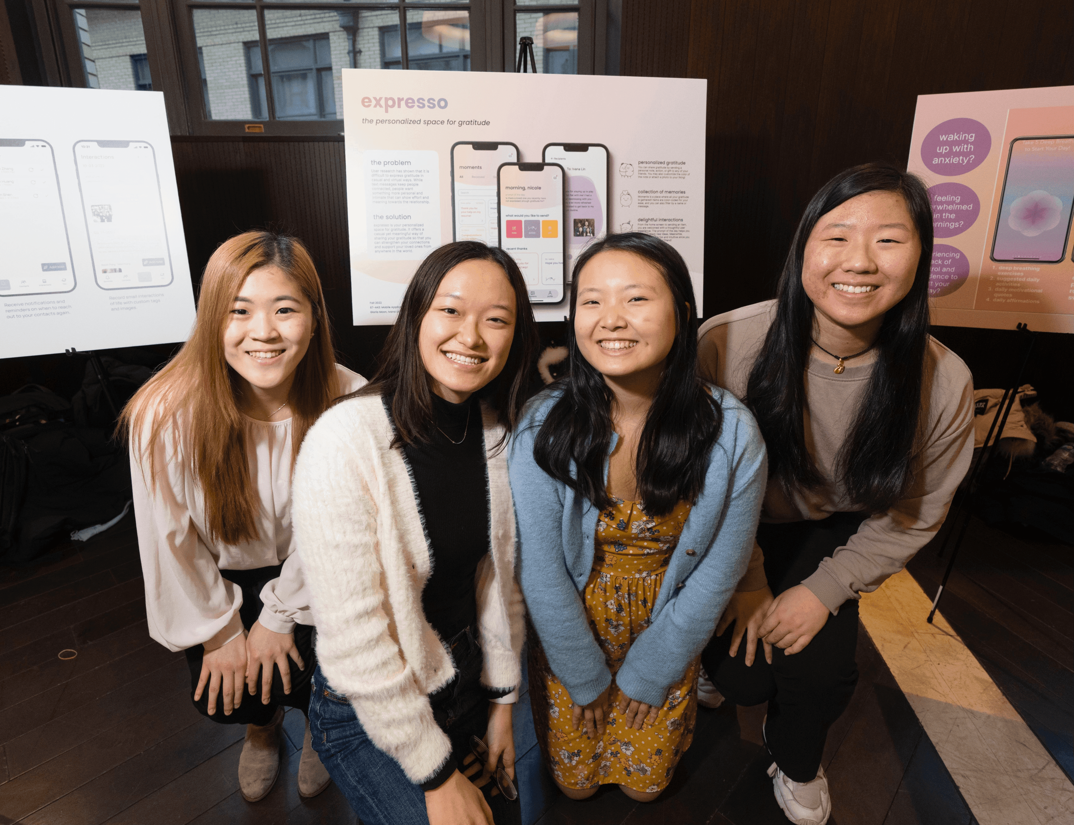
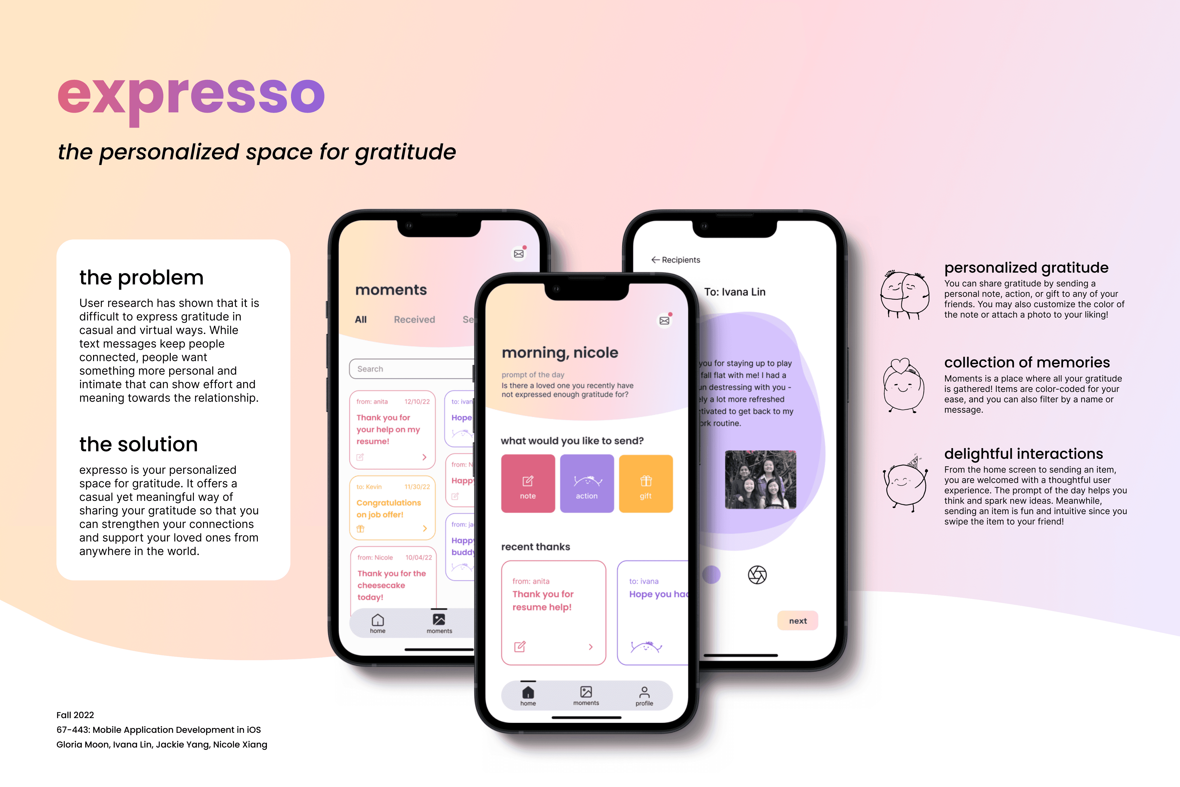
We also presented at the project fair hosted for this course and represented at Dietrich Prospective Student Day.
We created a poster to present at the project fair hosted for the course and represent at Dietrich Prospective Student Day.
Next Case Study
Themes & User Needs
Spotify: Music Discovery
Spotify: Music Discovery
Keywords: information architecture, responsive design


