Role
UX Researcher
UX Designer
3 days, Sep 2023
Figma
FigJam
Overview
Problem
How might we help users to explore new music without extra effort?
Outcome
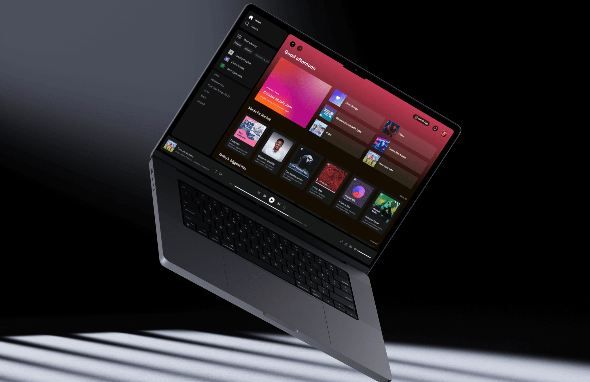
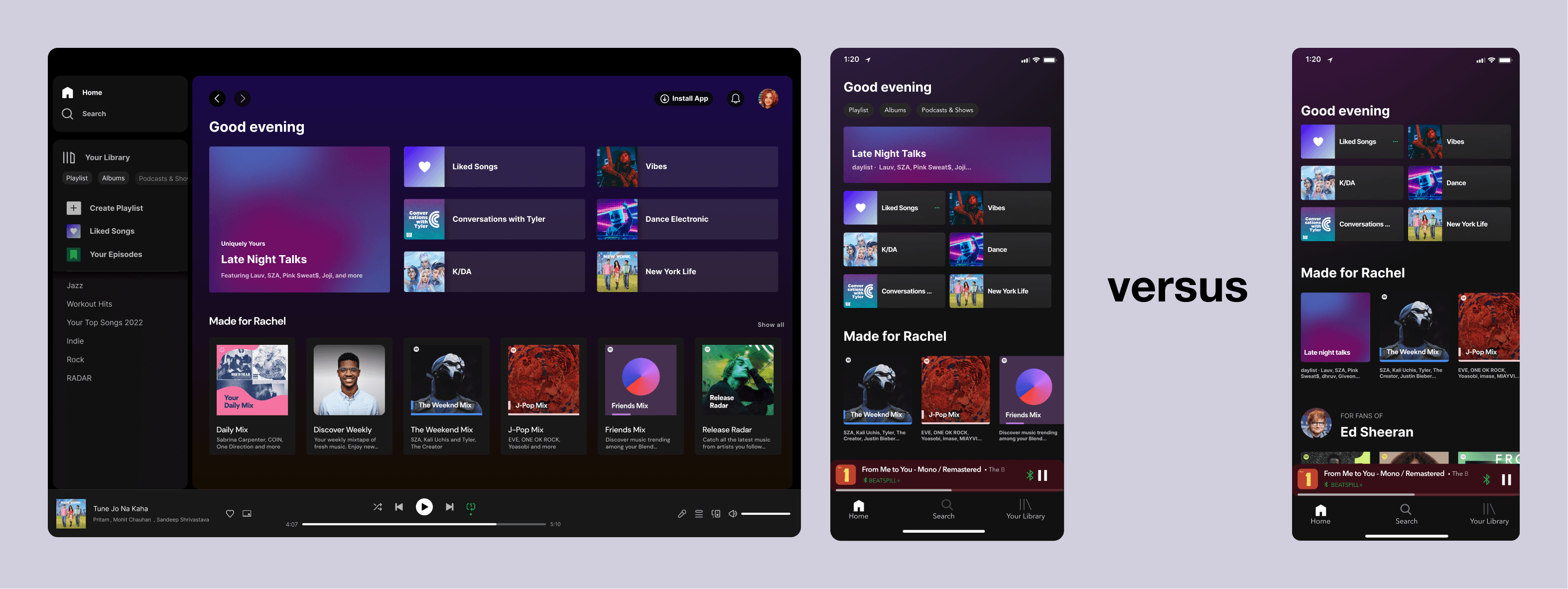
I redesigned Spotify's home page by surfacing existing features so that users can listen to new songs without actively doing so.
The Value
Choosing the Problem Space
When I chose Spotify as the platform to redesign, it was a very big problem space. After analyzing Spotify, I thought that the discovery space had the most opportunity.
Why does this matter to Spotify?
As I shared earlier, Spotify's mission is to share human creativity for artists and fans, meaning that a two-way interaction (releasing content & listening to them) is key to Spotify. However, if users are not discovering/listening to new music, part of this two-way interaction is lost (something that's extremely valuable for both artists and Spotify as a company). Therefore, enhancing content discovery experience will not only engage the artist-listener relationship but also help Spotify achieve its mission.
How is success measured?
Due to the limited time and resources for research, there are many risks taken and assumptions made during the entire project. To mitigate, I set up success metrics so that the solution can be evaluated.
Success Metrics
Click through rate: what percentage of users click on the personalized Mix on the home page?
Retention rate: what percentage of users return to the personalized Mix?
Number of new songs added to personal playlists: how many new songs from the Mix are added?
Rate of a Mix being added to Library: what percentage of users save personalized Mix?
Setting Expectation
What to expect for this project?
Research Findings & Insights
Understanding how users are discovering music right now.
I conducted contextual interviews with 9 Spotify users to familiarize myself with what "discovery" means to them and what the pain points are. Here are the findings.
"I feel like it takes so much effort to find new music I will actually listen to."
Through my study, two types of Spotify sessions are synthesized:
Passive listening: music is the background sound.
Active listening: Spotify is the user's focus.
Passive listening is where the project focuses on, because most of the time, users play Spotify in the background while they do something else. In addition, the first step taken in a passive session is either clicking on a recent playlist, autoplay/radio recommendation based on artist/song, or search for a mood. This means that the entry point of the solution will likely fall into one of these categories, or on the page where these actions occur.
Current Features & Flows
What are the existing features related to music discovery?
In addition to user interviews, I dived deep into what Spotify's current user flows and UI are like. Below, I analyzed the key existing features and pain points.
Home Page
Observations
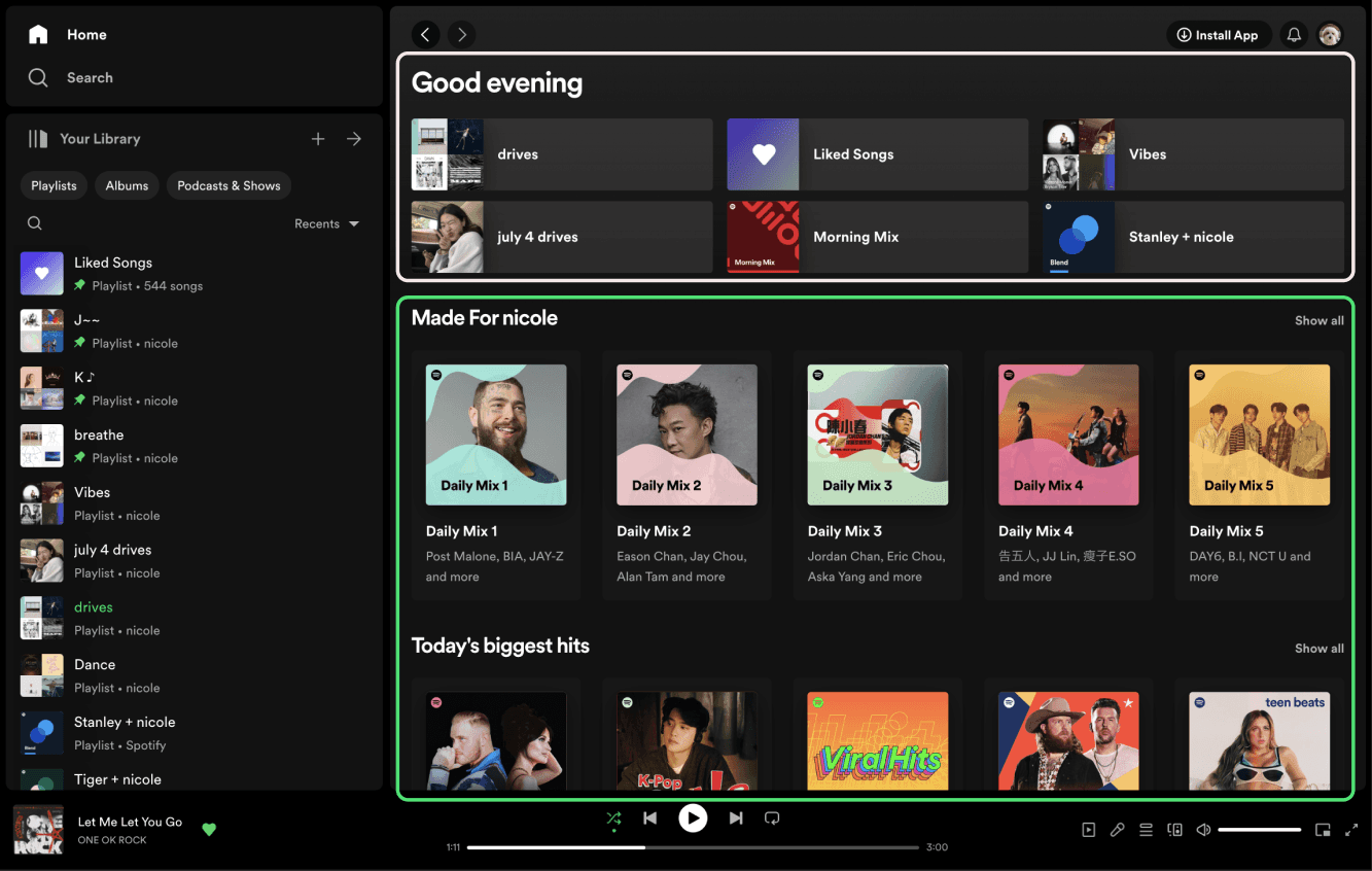
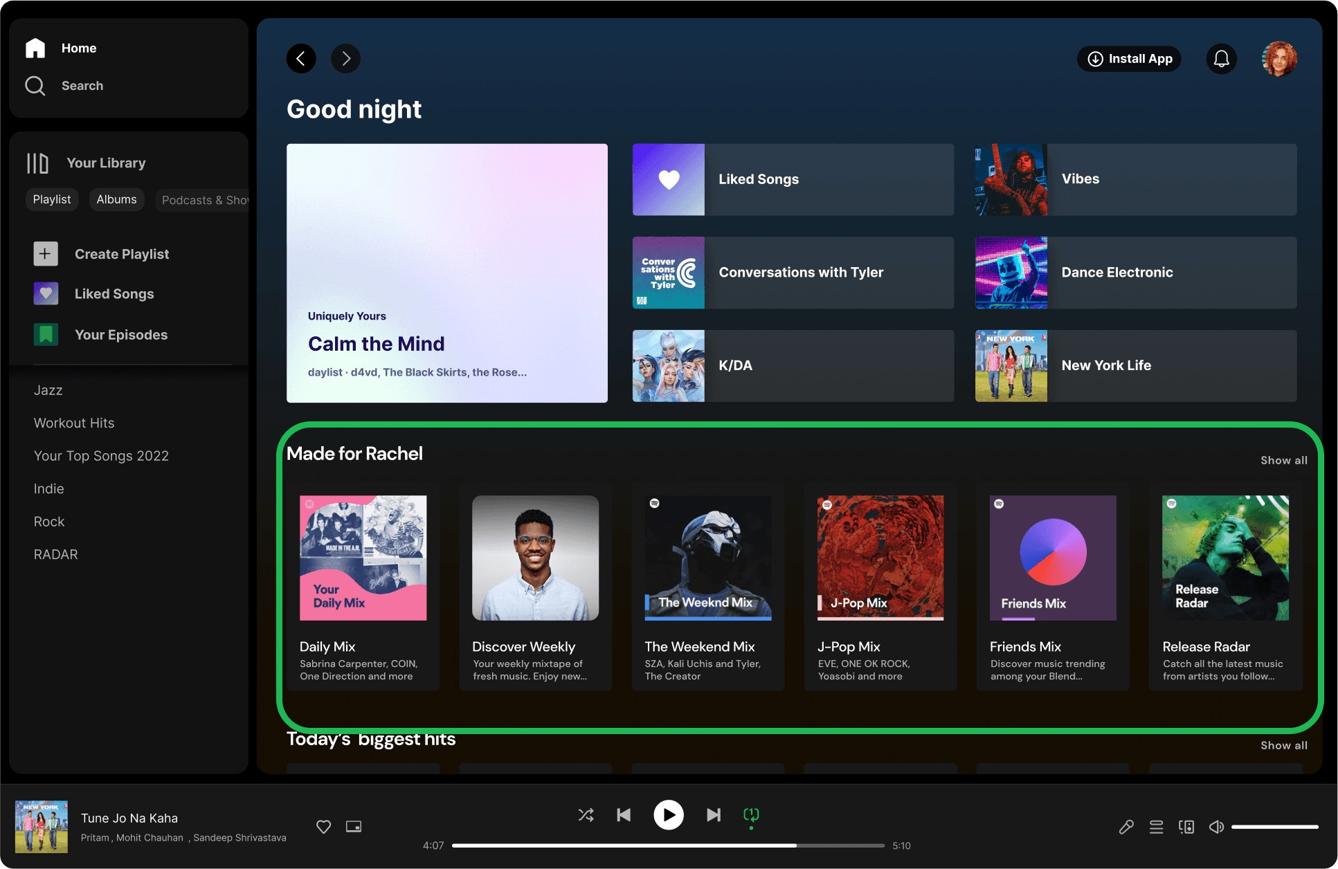
The home page consists of 2 main sections: 1) recent playlists 2) playlists made for user and popular hits. From research, users rarely scroll down so the main areas of interactions are recent playlist and made for <user> (highlighted below).
Pain Points
Daily Mixs are not named after the content, instead they are just numbered (i.e. "Daily Mix 3"). The only way users know what kind of mix this is is by looking at the playlist cover image and the description.
Daylists
Observations
After poking around the Made for You album from the search page, I found a recently rolled out feature "daylist", which is a dynamic playlist based on user listen history at different times of the day and day of the week.
Pain Points
Currently, it takes users 3 steps to reach daylists (shown below): 1) go to search page 2) click on Made for You 3) click on daylist. Because it's burried under all the other existing Mixes and there are many layers users need to go through, it becomes much more difficult for them to discover this playlist and remember it.
Brainstorm
How can we help users engage in new content during passive listen sessions?
Now that I have a clear direction on the problem space an user needs, I started brainstorming solutions and mapped them out on an impact effort matrix to prioritize.
Impact effort matrix
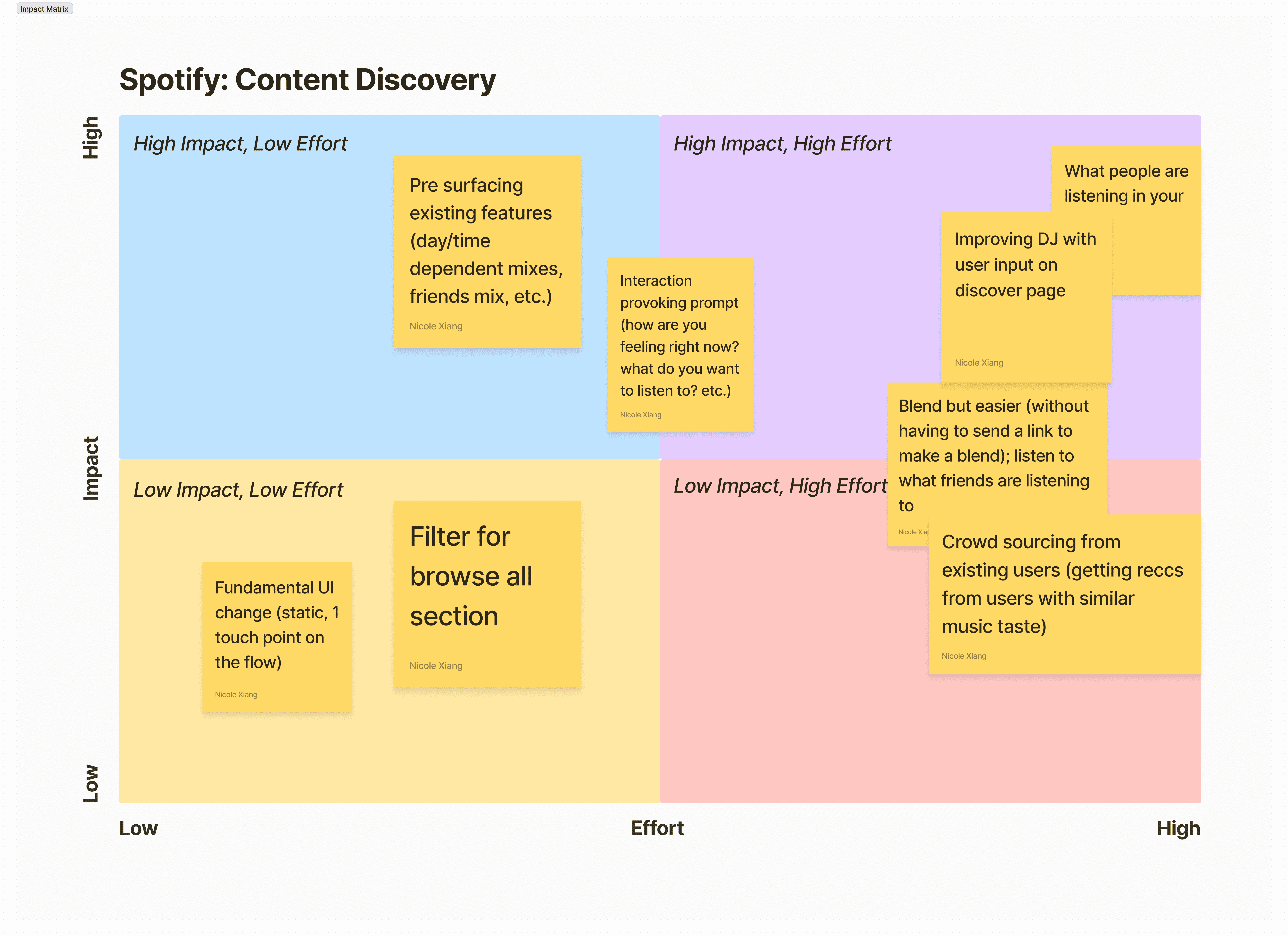
Because there are a lot of ideas, I created an impact effort matrix to evaluate and visually see which ideas should be prioritized. This X axis describes the amount of effort and Y axis describes the level of impact. This helped me identify the low-hanging fruit: pre-surfacing existing features.
Narrowing down ideas
From the impact effort matrix, I selected two ideas to explore further: 1) pre-surfacing existing features 2) improving DJ with user input. Idea 1 was selected because it is low effort and high impact since we are working with existing features. Even though idea 2 is high impact and effort, I wanted to play around with it because from one of the insights from user research is that users aren't utilizing the DJ only because of the lack of flexibility (lack of user input).
Sketches & Prototyping
Using gorilla testing to support design decisions given the quick turnaround time.
While making the wireframes, there were many small design decisions that had to be made because I'm redesigning an interface that users are very familiar with. So my guiding question was always "how can I redesign it to ensure quick & easy adaption period?".
Wireframes
One of the most challenging parts of the project is attention to detail. Below are examples of wireframes evaluated based on gorilla testing with 5 users.
Placement of daylist playlist
There were two places I could pre-surface daylist: part of the recently played section & "Made for <user>" section. Gorilla testing shows that participants tend to only focus on the upper part of home interface (everything above "Made for <user>"), meaning that if daylist is placed in "Made for", it's likely to be overlooked. Therefore, the wireframes on the left are selected.
Enhancing DJ feature
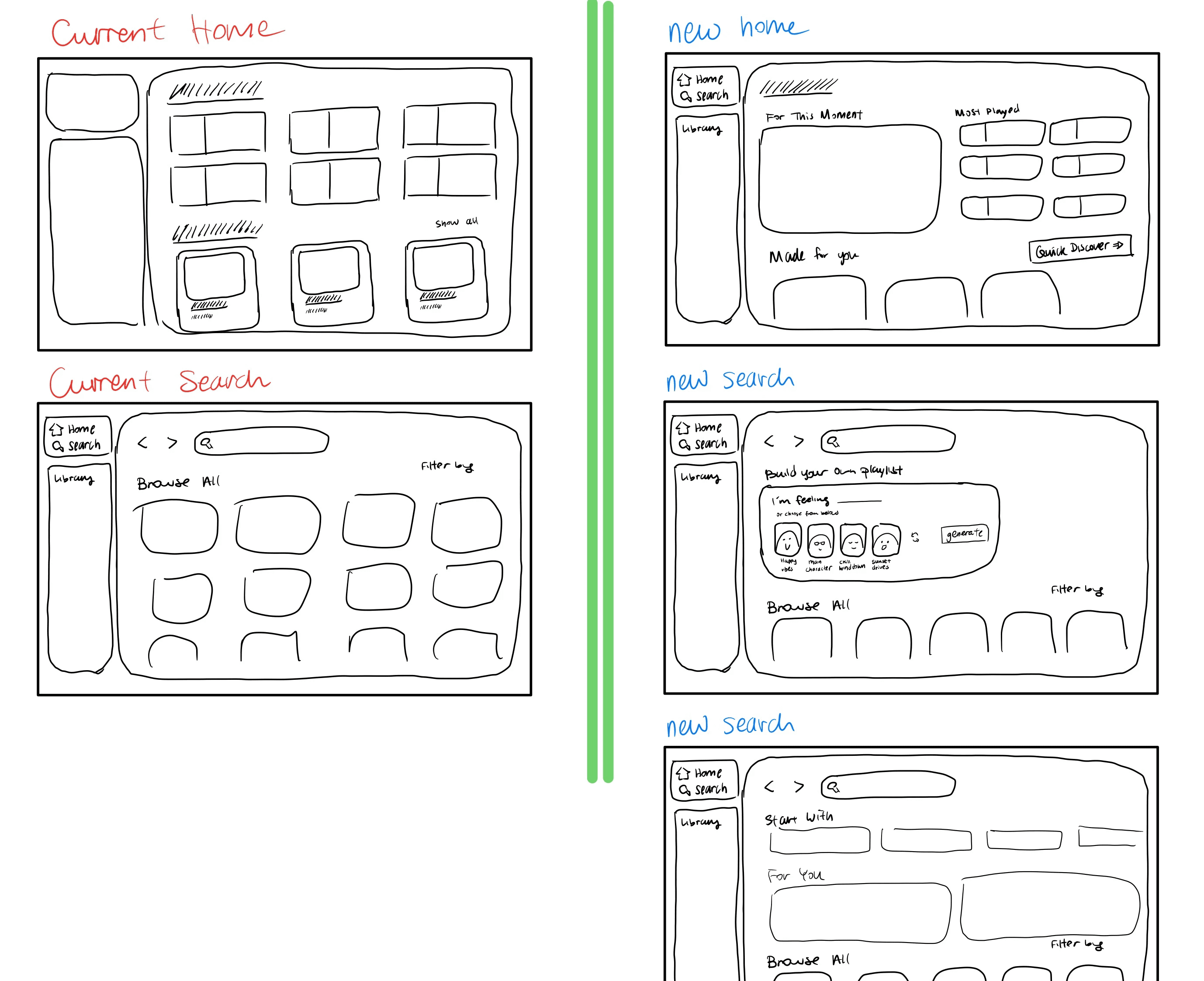
On the left is my initial exploration with user-input-based DJ. Users can either type in how they are feeling or choose from recommended playlists to kick start the DJ. This idea was quickly eliminated because 1) it requests significant engineering work 2) involves too many steps — users can just search up what mood they are in.
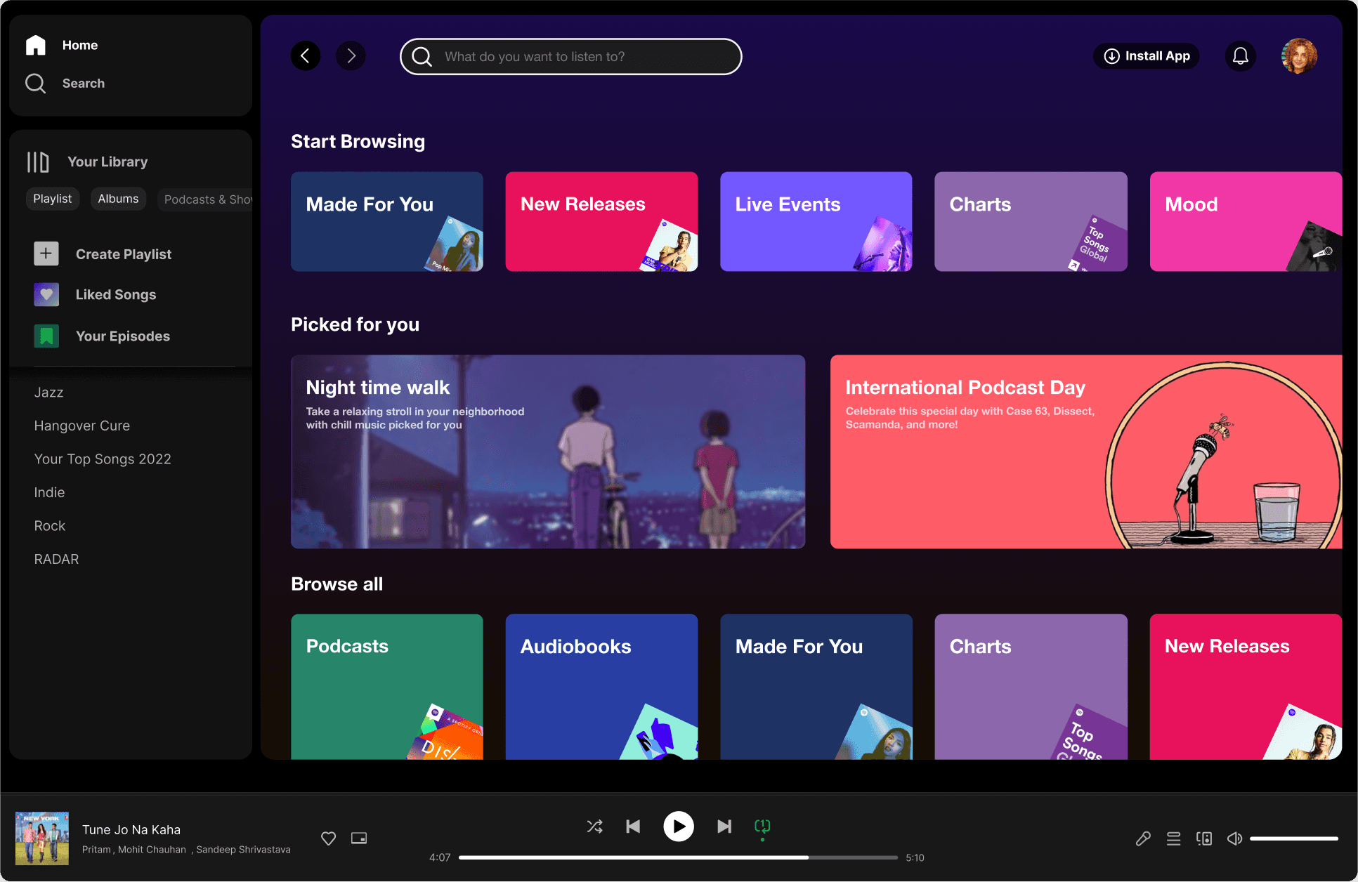
On the right is the redesigned desktop interface to be consistent with the mobile view. As I was conducting gorilla testing, I noticed that mobile and desktop had different interfaces — desktop only has "browse all", while mobile also has "Start browsing", "Picked for you".
Final Prototype & Features
Breaking down the changes & data-thinking
In addition to redesigning, I also considered the impact and kind of data that would be used.
Daylist
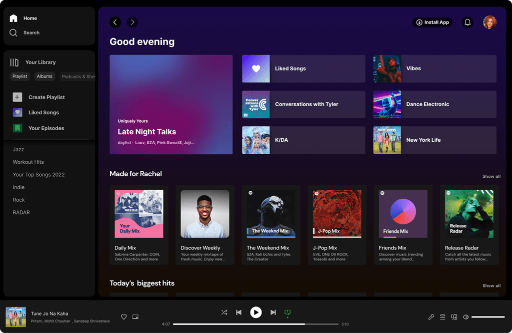
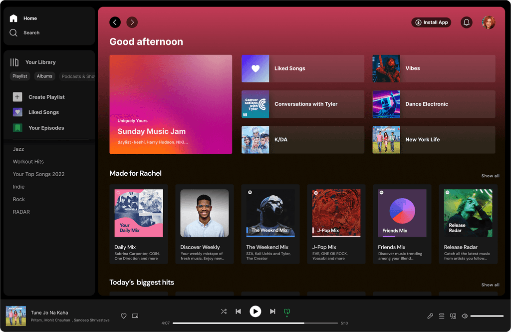
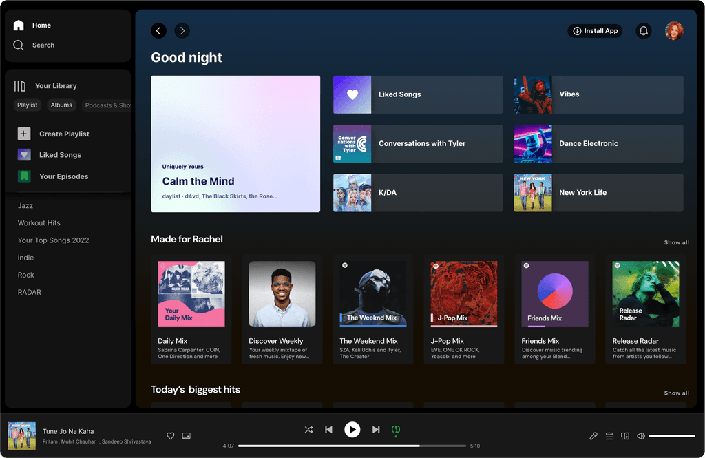
With daylist which is dynamic, the home page becomes adaptive user interface (AUI). This feature uses historic user data on listening activity. In this case, Rachel listens to chill music on Saturday nights so the daylist "Late Night Talks" is displayed.
The machine learning model can also build daylist based on user activity. For example, Rachel runs every afternoon so the daylist would contain more energetic songs as a response.
Impact: it now takes 1 step to reach daylist instead of 3.
Selected "Made for <user>"
Instead of just different daily mixes, I included mix's based on users' top artists, friends mix, and genre mix.
Discover Page
I followed the most updated mobile UI and redesigned the desktop version. The "Picked for you" section contains playlists based on time of the day and special events/albums Spotify has.
Learnings
Reflecting on the Project
This was the fastest project I've done so I really got to challenge myself to build fast and fail fast. Having little data & resources to work with was uncomfortable at first because of the lack of evidence, but because of this, I learned how to evaluate and mitigate risks.
